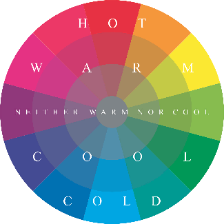

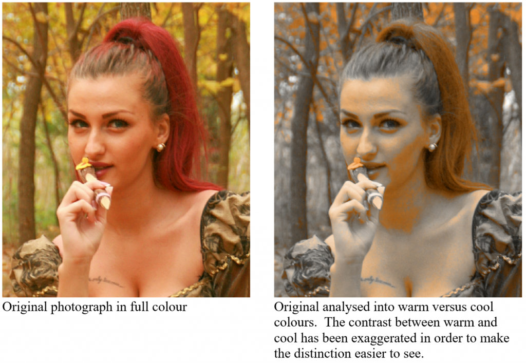
Broadly speaking Magenta and Yellow are warm, while Cyan is cold. In Fig. X the colour wheel is labelled so as to give a general idea of the colours which are classified as warm against those which are cool. But what is really important is the relationships of one colour to another. For example grey is cooler than red, but warmer than cyan. Subtle colours such as red-grey and blue-grey may count as warm if they are next to cyan, but cool if they are next to Red. This is seen most clearly in the painting of a face, in which warm versus cool means little more than pink versus greyish pink, and yet the distinction can be clearly felt. The onlooker feels a richness of colour sensation, even without being consciously aware of the distribution of warm and cool.
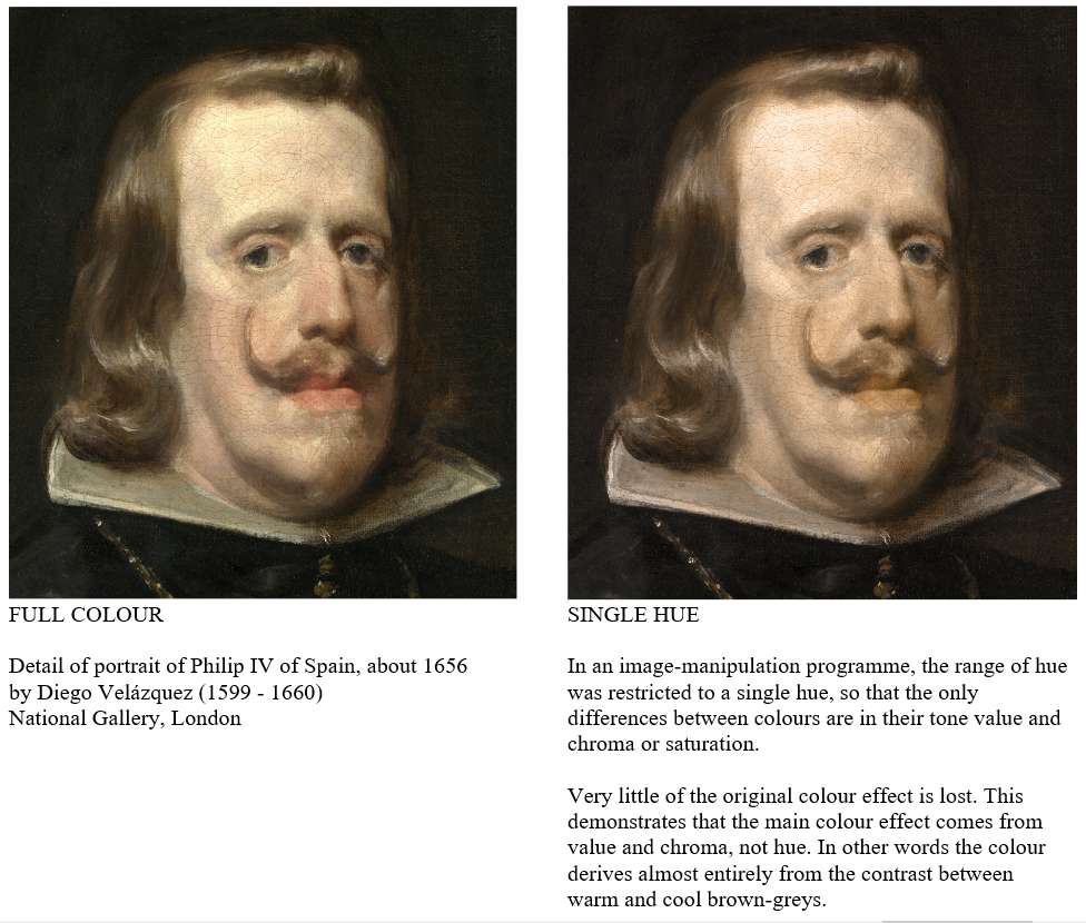
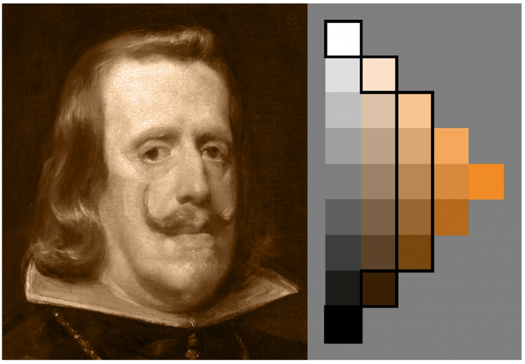
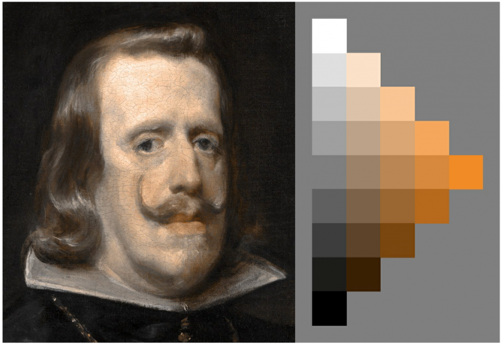
When Velasquez was young he modelled faces largely by controlling light and dark. As he went on he relied increasingly on colour. In other words he reduced the contrast of light and dark and made the contrast of warm and cool indicate where the face turned away from the light.
A detail from a photograph:Grass and heather moorland near Bayhead for NG0785© Copyright Julian Paren and licensed for reuse under this Creative Commons Licence
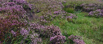
The human mind seems unconsciously to prefer colours to be placed into groups of warm and cool. Some say that the hardest colours to compose are green and purple, because they cannot easily be classified as either warm or cool. They set up a dissonance in the mind of the viewer, who struggles unconsciously to find a suitable category for them. The most difficult subject from this point of view is a scene of purple heather on green grass. A skilful artist might cope with such a subject by diminishing the areas in which these colours occurred. Or perhaps, he might introduce a large area of Cyan, say (perhaps a large blue sky), which would look so cold against the purple and green that they would then fall into the warm category by comparison.
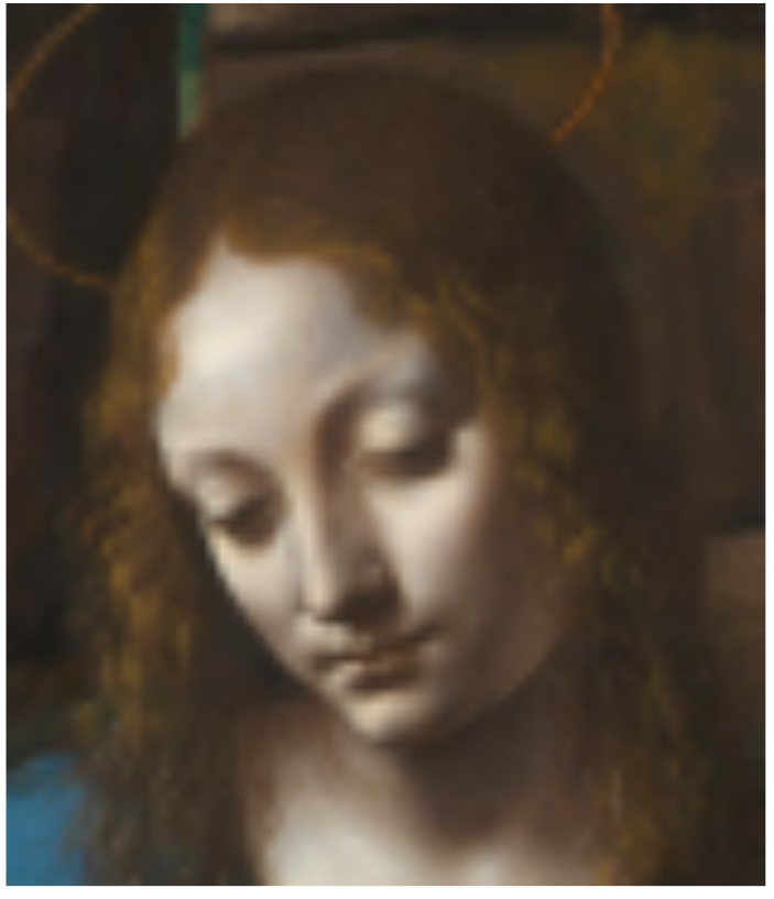
Leonardo da Vinci (1452 – 1519)
National Gallery, London
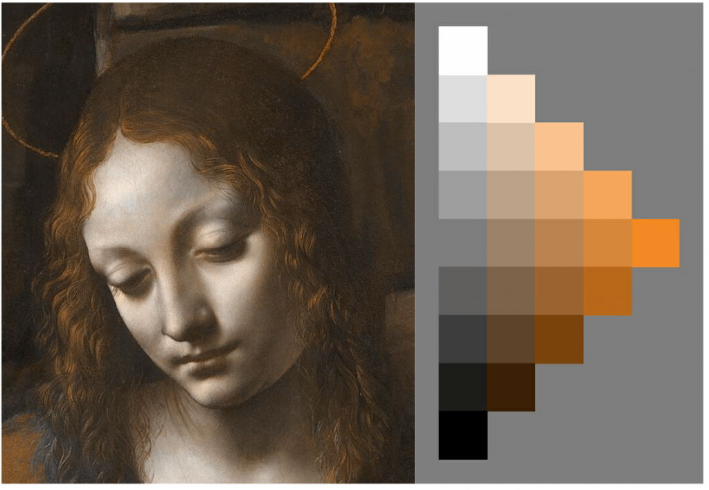
Very little is lost in the colouring of the head.
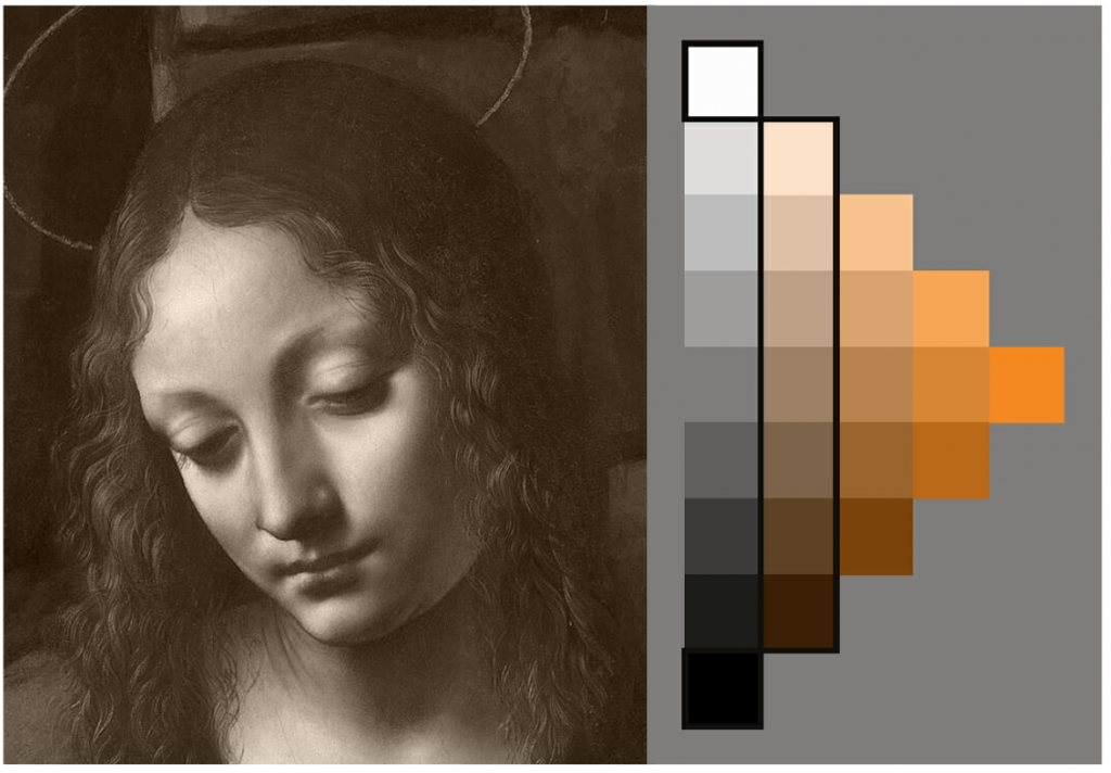
The colour in the face is almost identical to that in the single hue version above.
This shows that, in this picture at least, Leonardo paid almost no attention to variations of warm and cool in the skin tones, in contrast to Velázquez (above).
A quotation from Bernard Dunstan:
Colour must be the most subjective and subtle of all the aspects of the painter’s art, and the one which has had the greatest number of attempts, from Goethe onwards, to systematize it. There have been innumerable teachers and theoreticians who have made up colour scales, circles and charts which should, according to them, result in ‘perfect’ harmonies, but I have always doubted whether theoretical study can do much for a painter’s sense of colour, and I have a great sympathy for the Flemish painter who, on finding one of his pupils studying a treatise on colour harmony, advised him to ‘put it away and rather to spend some time on observing what is to be learned in the way of harmony of colours from the sky at sunrise and sunset—but then it would be a question of seeing with heart and soul’.
P146 Paintings in Progress, Bernard Dunstan, 1976
To me, this gets at the heart of the matter in two ways.
First, good colour is so much a question of subtlety of graduation, the relation between neutrals and purer tones, the play between warm and cool. All of these can be observed in the sky, or, for that matter, in the painting of flesh; none are adequately covered by the theoretical approach, which almost invariably deals with flat areas of pure colour.
Secondly, the Flemish painter’s insistence on ‘seeing with heart and soul’ seems to me of paramount importance. What we learn as painters through an emotional attachment to the subject is more likely to be of use to us than merely abstract knowledge.
The actual material quality of the colour also gets left out from the scientific approach, and this always seems to me very important. All the finest colourists also have a sensitive feeling for the quality of surface that they are making, and a picture in which the painter has enjoyed the ‘feel’ of the paint has a better chance of achieving good colour.
Again, I am grateful to my own training for insisting on the accurate observation of tonal changes, even if colour was not often mentioned, because this seems to me an excellent preparation for examining with equal attention later on the gradual changes of colour, for example as the light falls across a form. One essential fact about colour was, indeed, stressed; the changes from cool to warm colour in the painting of a head. It could almost be said that if the student can make a good shot at this very subtle problem he is well on the way to becoming a colourist.
It is perhaps a comforting thought that most of the finest colourists have begun by painting low-keyed, sometimes almost monochromatic pictures—a study of the history of art will give plenty of examples, so I need only mention Van Gogh and Manet. Certainly a sensitive handling of neutrals and greys is an essential part of the painter’s development and it has often been said that it is in the use of half-tones that the good colourist can be seen.