
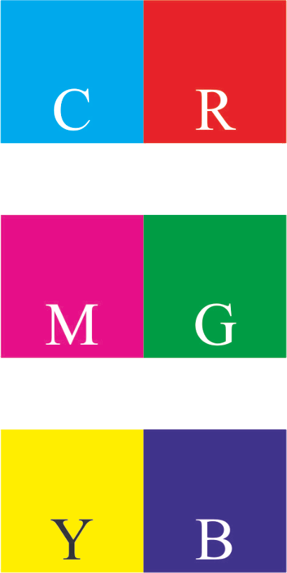
Right: The printing primary colours with the addition of their complementary colours (the primary colours of photography, television, and computer monitors): Red, Green, Blue.


Everyone interested in the art of painting is likely to benefit from being able to talk about colour in terms which are widely understood. This involves an understanding of what is meant by terms such as Hue, Tone, Tint, Shade, Value, Chroma, and Saturation.
These terms make it much easier to discuss how painters have chosen and arranged their colours, and in what way they have made new steps in the art of colouring. Without this terminology it would be very hard to discuss, say the differences between Venetian and Florentine colouring, or the revolution in colouring which the French Impressionists brought about.
Such terms as these gained in precision when theorists began to study colour scientifically. We are now surrounded by pictorial devices such as televisions, cameras, and computers which depend on the work of such theorists. These devices incorporate a system of colour specification which is based ultimately on the approach of one American portrait painter, Albert Munsell.
When Munsell was talking to his students about colour, he found that misunderstandings often arose simply because colour names were so imprecise. One person’s idea of blue might be much greener than another person’s. Munsell resolved to specify colours in a way which would be precise and unambiguous, yet practical for for the ordinary beginner.
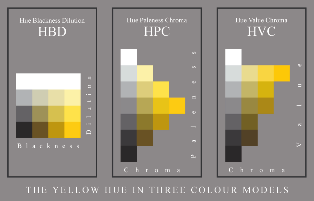
HUE – BLACKNESS – DILUTION
This colour model shows colours as they might be mixed by a watercolourist.In order to match a yellow using this model:
1. Identify the colour on the chart which is closest to the colour to be matched (the ‘target’).
2. Look at the colour which appears at the base of the column in which the target colour occurs.
3. Mix the strongest example of the hue with Black until a match match for this colour has been achieved.
4. Add water to achieve the required dilution.
HUE – PALENESS – CHROMA
This colour model shows colours as they might be mixed by an oil-painter who is particularly concerned with strong colours.
The rows become increasingly pale the nearer they are to white, and decreasingly pale (or darker) the nearer they are to black. The strongest example of a hue is always in the middle row.
The columns become increasingly strong in colour as they approach the strongest example of the hue. Or, to put it another way, they become increasingly weak, or soft, in colour as they approach the grey column.
The patches in each column are equal in chroma (strength, greyness, or saturation). They vary only in paleness.
In order to match a yellow using this model:
1. Identify the colour on the chart closest to the colour to be matched (the ‘target’).
2. Look at the colour which appears at the far right of the row in which the target colour occurs.
3. Mix the strongest example of the hue with White or Black until a match for this colour has been achieved.
4. Mix the resulting colour with a grey from the same row in order to achieve the required chroma.
HUE – VALUE – CHROMA
This colour model shows colours as they might be mixed by an oil-painter who is particularly concerned with tonal values.
The rows are all of the same tonal value. The strongest example of a hue is always in the row which is of the appropriate tonal value. In this case yellow is in a high row, because it has a high tonal value.
Just as in the HPC model, the columns become increasingly strong in colour as they approach the strongest example of the hue. The patches in each column are equal in chroma (strength, greyness, or saturation). They vary only in value.
In order to match a yellow using this model:
1. Identify the colour on the chart closest to the colour to be matched (the ‘target’).
2. Look at the colour which appears at the far right of the row in which the target colour occurs.
3. Mix the strongest example of the hue with White or Black until a match for this colour has been achieved.
4. Mix the resulting colour with a grey from the same row in order to achieve the required chroma.


The three primaries mixed in appropriate amounts make black.
Black mixed with white produces a range of greys.
The greys and black and white are also called ‘neutrals’.

These steps may range from only a few to a continuous blend.
Here Cyan is taken as an example
From this basic range of hues at their strongest, and the greys from white to black (C+M+Y) it is possible to generate an extremely wide range of colours.
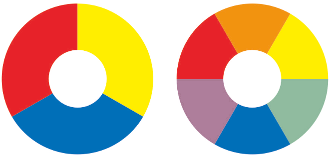
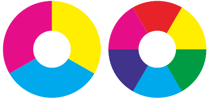
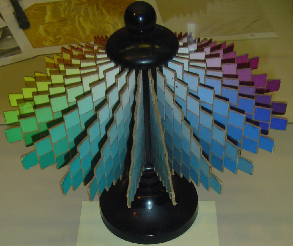
As an initial demonstration of how these three primaries the grey derived from them work in practice here are three diagrams which show the Yellow hue arranged in three different ways. Such arrangements are often called ‘colour models’ – ways in which colours may be ordered and, often, given numbers.
In each block, apart from the greys, there are 9 swatches of the Yellow hue, varied by adding different amounts of white (or water in the case of watercolour painting). The diagram could be made with many more steps than those shown. The number has been restricted for the sake of clarity.
The Yellow in this diagram tends slightly towards Magenta, and is perhaps closer to what most people would expect of a Yellow than the primary yellow from the CMY group. That yellow is slightly greenish compared with what many people would expect of a yellow. In this diagram the yellow tends neither towards green nor towards orange. The dark examples of this hue are a kind of brown. They also tend neither towards green nor towards orange. Each colour model offers a particular advantage. The HBD model corresponds to the way watercolour is mixed, the HPC model to the way oil is mixed by a painter particularly concerned with strong colour, and the HVC model to the way oil is mixed by a painter particularly concerned with tonal value.
These charts show only the Yellow hue. Other charts further on show examples from the complete range of hues.
COLOURS, PIGMENTS, AND PAINTS
Ideally the word ‘colour’ is used to specify only appearance. As, for example, in green grass, green pigment, and green paint. All three may match in colour and yet be made of different materials.
Colour is the sensation produced in the eye and brain.
In spite of this, an artists supplier is sometimes said to provide ‘artists colours’ meaning paints or pigments.

by Winsor & Newton
Publication date 1895 ca.
An example of the word ‘colours’ being used to mean pigments and paints.
https://archive.org/details/catalogueofcolou00wins

A binder (oil in this case) being added to powdered pigment. A glass muller is at the ready, in order to mix the pigment with the binder more thoroughly .
This process is sometimes known as ‘grinding’, though it is correctly called ‘dispersing’.
It does not involve grinding the particles of pigment to make them smaller – a process which is carried out separately and usually by the pigment supplier rather than by the painter.
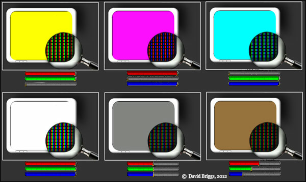
Screens are made up of the equivalent of tiny lamps, each showing either R, G, or B.
For example, in the diagram above, Yellow is displayed when the Blue lamps are switched off and the Red and Green lamps are switched on. The Red and the Green combine to make Yellow.
A SOURCE OF POSSIBLE CONFUSION – Cyan versus Blue
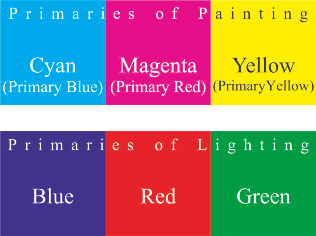
Sometimes it is said that the primary colours of painting are Red, Blue and Yellow, but that the primary colours of lighting are Red, Blue and Green. This sounds strange, as if both sets of primaries included Red and Blue, and differ only in that the painting set includes Yellow, whereas the lighting set includes Green. But, as shown above, the Red (Magenta) and Blue (Cyan) in painting are not the same colours as the Red and Blue in lighting.
In fact, one set or primary colours is made up of the complementary colours of the other set. After a while it becomes second nature to refer to the primary colours of paintings as Cyan, Magenta, and Yellow, (CMY) and their complements, the primary colours of lighting, as Red, Green and Blue (RGB).
‘Blue’ in this context tends more towards purple than many viewers might expect, so much so that the Victorian painter, the Hon. John Collier referred to this colour as ‘Violet’ in his, A Manual of Oil Painting (1886). However the RGB triad is now so familiar from computers and television that most people can pick up this usage without difficulty.
1883 by John Collier (1850 – 1934)
John Collier described the RGB lighting primary colours very thoroughly in his book for art students, although he used the word ‘violet’ for what is now called the blue of RGB.

Any three colours could be chosen as the primaries, as long as each could not be mixed from the other two. In practice, Cyan, Magenta, and Yellow produce a greater range of very strong colour mixtures than any other primaries. In this sense, they are the most productive primaries of paint.
2 colours are said to be complementary if, when mixed together in appropriate amounts, they would produce black or neutral grey.
The complementary colours of Cyan, Magenta, and Yellow, are – the primary colours of lighting, Red, Green and Blue (R, G, B).
RGB form the basis of the colour that appears on televisions, on computer screens, and in digital cameras and mobile telephones. This technology is now so ubiquitous, that many people are likely to find a basic understanding of these colours valuable, even if it is not strictly necessary for painters.

Lamps, filtered with celluloid which has been tinted Red, Green, and Blue, may be directed onto a white wall in a dark room.
Each beam of light adds a degree of brightness. Red and Green combine to make a brighter colour, Yellow.
When Blue is added, the three beams combine to make white.
So Red, Green and Blue are referred to as primaries which are ‘additive’. When such lights added together they increase the brightness.

These three primaries of lighting have a long history. The study of colour was taken up by James Clerk Maxwell (1831 – 1879) the Scottish physicist best known for his formulation of electromagnetic theory.
Using one of the coloured spinning tops invented by a colleague, he was able to demonstrate that Red, Green and Blue combined to make a dull white.
His paper “Experiments on Colour” laid out the principles of colour combination and was presented to the Royal Society of Edinburgh in March 1855.
He is holding one of his colour wheels.

When all the primaries (Cyan, Magenta and Yellow) are mixed together they make Black – a colour which is said to be complete, because it includes all the primaries. Red is made up of Magenta and Yellow, so black made from Cyan (C) plus Red (M+Y) shows all the primaries together. CMY.
This means that Cyan and Red complete each other to make Black. Cyan and Red are ‘complementary’.
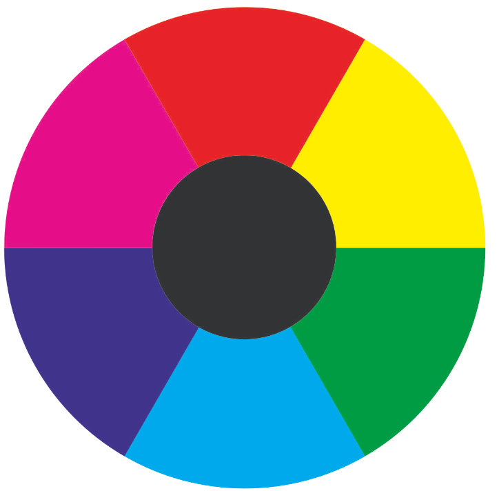
Colours which are opposite in the colour circle are complementary.
Cyan is complementary to Red
Magenta is complementary to Green
Yellow is complementary to Blue
When mixed in appropriate amounts, these complementaries make a black, or a very dark grey – at least in principle. In practice, depending on precisely which pigments are chosen, a certain amount of colour adjustment may be needed in order to produce a perfectly neutral result.
Complementaries are often used by artists to increase the contrast between colours. The Venetians frequently used a blue which emphasised the warmth of the reds, oranges and yellows.

Bacchus and Ariadne (1520-3)
Left: Venetian painting by blue used to enhance warm colours. (Reds, Yellows and browns).
Left: Venetian painting with blue reduced on the computer. The warm colours would normally now look less warm. (The reds Yellows and Browns would look greyer, even though they have not been touched).
However the blue of original in its current state (at left) is arguably too flat and overpowering – the result of repainting by a restorer.

An enamel plaque of Bacchus and Ariadne, after Titian
Signed and dated ‘H. Bone 1811’
This copy probably gives a better idea of the correct colour balance.
Left: the copy.
Right: the copy with the blues reduced on the computer.
The mixing of the primaries shown with paint.
Artists tend to merge one coloured pigment into another on the palette (as shown here), thus producing a wide range of colour as they work. It is typical of experienced artists that their palettes will be covered with sequences like this, whereas beginners typically make many little piles of separate mixtures.

Colour wheel . 1809
Johann Wolfgang von Goethe (1749 – 1832) German poet, novelist, playwright, natural philosopher, diplomat, civil servant and colour theorist..

Modern primary colours. From about 1934.
Given the fading of Goethe’s paint, his wheel is remarkably close to the modern standard.
The colour wheel, or circle, has a long history stretching back to the Greeks and probably before. Here is an example drawn up by the German poet and scientist, Goethe. If allowance is made for the fading of his paints, the choice he made of the primary colours and their complementaries is remarkably similar to the modern colour wheel.

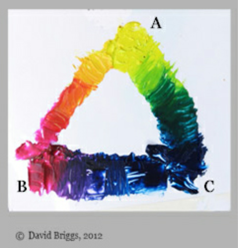
This illustration demonstrates how Cyan, Magenta and Yellow (CMY) colour mixtures come about. When pieces of transparent celluloid – tinted CMY – are stacked on white paper, the area where they all overlap looks black.
Each added layer of tinted celluloid subtracts from the brightness of the white paper, making it appear darker. So Cyan, Magenta and Yellow are referred to as primaries which are ‘subtractive’ – they take away from the brightness of the image.

In the ubiquitous silver-halide photographic prints, (for example, those provided by high-street photographic processors), colour comes about in a similar way. Transparent dyes are incorporated into the paper. The three dyes together at full power producing a deep black.
Very few paints are as transparent as these dyes, so paints of the three primary colours cannot usually produce a deep black, only a very dark grey. For this reason, painters who want a deep black use either a black pigment, or make a black mixture from, say, Burnt Umber and French Ultramarine. But, to keep matters simple, it is probably better to concentrate at first on just the three primaries and white. Strategies to deal with the partial opacity of most paints may be left until later.
When mixed these produce orange, green and purple, but the green and purple are dullish examples of those hues.
with the colours which arise when they are mixed – Red, Green and Blue.
The limitation of Red Yellow Blue when used as primaries was long recognised. We have seen that Goethe used the CMY primaries as long ago as 1809. These primaries came into general use in about 1890, when the CMYK printing process made its first appearance.
The RYB primary group is still taught. Some writers claim that it is based in psychology. For example, most people feel that Red is the most exciting colour, even though Magenta forms part of a more productive group of three colours.
But Green may be made by mixing Blue and Yellow.
MIXING AND MATCHING COLOURS
In recent times, scientists have discovered a great deal about how the sensation of colour is produced in the eye and brain. At the root of all colour-theory lies the human response to light – a response shared by all who can see, whether or not they have any understanding of the latest scientific theories. Here we shall consider only the few principles which may be helpful to artists and art-lovers.
The first of these is one that is familiar to most people from their earliest days at school – that all paint colours, apart from some of the very brightest, may be mixed from three primary colours plus white. The primary colours are so called because they cannot be made by mixing others together – they are the first colours one needs. For example Yellow cannot be made by mixing any other colours together, whereas Green may be made by mixing Yellow and Blue (Cyan) together. So Green is called a secondary colour – one that may be made by mixing the first, or primary colours.
At school most people learn that the primary colours are Red, Yellow and Blue, but these names cover a wide range of possible colours. ‘Blue’ for example can refer to anything from violet to turquoise. In fact any representatives of Red, Yellow and Blue can be effective as primaries, just so long as each one cannot be mixed by the other two. The three colours which, when mixed, produce the widest range of strong colours are Cyan (a greenish blue), Magenta (a purplish red) and Yellow (a slightly greenish yellow). Painters who understand how to use these primaries, will also understand how to use the other colours.
Any three pigments which are close in appearance to these primaries will give a range of colour almost as great. For example: Prussian Blue, Alizarin Crimson and Lemon Yellow will give a very extensive range, just as will many other pigments which resemble them. Some manufacturers produce paints, specially formulated to provide a very close match to Cyan, Magenta and Yellow. With watercolour , a white ground will show through. The more the paint is diluted with water, the more the ground will show through, and the paler the colour will appear. This is true for all transparent paints and dyes.
With oil paint, or any paint which is largely opaque, the ground will hardly show through at all, especially when the paint is brushed on thickly. In order to make a mixture look paler, white paint has to be added . The more white that is added, the paler the mixture will become.
No paint is perfectly transparent, nor perfectly opaque. Dyes, on the other hand, can be almost perfectly transparent.

17th Century colour-matching
The old instruction manuals do not give very much help regarding the matching of colours (‘tinctures’). For example in The Art of Painting (1692), Marshall-Smith gives recipes for many mixtures which would provide a fairly good match for the flesh colours (‘Carnations’) of someone who had a, ‘Clear and Beautiful Complection’.
He explains that these should be mixed (‘tempered’) on the palette using a palette-knife. But Marshall-Smith directs the student to go still further. He must pick up a sample of the mixture on his palette-knife and hold it up against the sitter’s face in order to compare. In this way he can judge how good the match may be, and continue adjusting until a perfect match has been obtained:
“Thus muft you temper them, till by comparing the Colour on the Point of your Knife with all the Carnations and Tinctures in the Face, you have obtain’d every Colour.”
Marshall-Smith gives no direction as to how such fine-tuning should be carried out. A student may well add touches of this colour or that, until he eventually achieves a match, but he may find it impossible at first to know which colour to add. This is where modern colour theory can help. By systematically removing differences in hue, value and chroma, the painter will arrive at the best possible match. This process does still involve trial and error, but, because it is better directed, errors are likely to be fewer and smaller.
Marshall-Smith
The Art of Painting… 1692
C A P. XXVIII.
The Art of Colouring.
P77

Portrait of Richard Boyle, 2nd Viscount Shannon
Detail from an unfinished portrait. An approach to painting which is very similar to that described by Marshall-Smith, whose book was published when Kneller was 46.

Louvre, Paris.
Painters had extraordinary control of subtle colouring well before colour theory developed. As far as can be learnt from old writings, painters had no theory of colour apart from perhaps some approximate notion of the primary colours.
A personal note:
MIXIN COLOUR IN AND AMATEUR CLASS
When I was teaching an art class for amateurs, many of the older women (born c 1920) disliked learning about primary colours and how they could be mixed. They told me that that such an approach to colour was a ‘man’s way’.
They explained that a ‘man’s way’ was too rigid and theoretical for them, though they were unable to tell me what would have constituted a ‘woman’s way’. They said that even the attempt to define a woman’s way was typical of a man’s approach, and to be shunned if possible.
As far as I could make out the ‘woman’s way’ involved learning a great many recipes, for example that the colour of a tree could be matched by mixing viridian with a touch of alizarin crimson, or that skin colour could be made from red ochre and white with a touch of ivory black. (Black being a colour which, they informed me, should not be used for anything else).
If anyone had run out of green, say, she would not mix it from other paints, but would ask her friends if they had any to spare. To me this seemed a strangely haphazard and inefficient approach to the problem of mixing colour, but on reflection I realised that it is probably the one which has proved adequate for almost the entirety of human existence.
It was only in the 17thC that theorists began in earnest their attempt to investigate the principles of mixing colour. Even now, despite modern theories, I suspect most people learn to mix colour more by trial and error than by applying colour theory.
Several years ago a painter told me that, after having studied at Norwich School of Art for 4 years, and then at the Royal Academy Schools for a further 3 years, it was only when he went on to teacher training college that he began to be taught any colour theory.
WARM AND COOL COLOURS
Most colour theorists have attempted to lay down rules which, if followed, will automatically result in a pleasing colour-design. In practice these do not seem to work out, in fact Bernard Dunstan RA wrote, the only the approaching a rule that seems to have some beneficial effect is the grouping of warm against cool colours. It is often said that a major distinction.
CMYK AND RGB
These two colour models are not essential to an understanding of how to paint, but they are very important when it comes to the way in which most people appreciate colour in the modern world. Although the means by which paintings may be reproduced accurately is improving all the time, sometimes using many different coloured inks, the basis of reproduction in books and magazines remains the same as it has done for about a century.
The only colours one sees on the printed page are Cyan, Magenta, Yellow and Black. It makes no difference whether an artist has painted a picture using 2, 3, or 25 different pigments: all will be reduced to the three primaries and black, printed on white paper. Similarly on the television or the computer screen, all colours will be reduced to three (Red, Green, and Blue), each varying from full power to zero – as dark as the screen will go. When all three are at full power, the screen will appear to be white.
The reason for pointing this out is that many artists believe such ideas as that, for example, black is bad, and yet they refer to the book illustrations of the great colourists, whose work is reproduced always with a black component. Similarly some claim that a great range of pigments is necessary because the rainbow contains rays shining at an infinite number of wavelengths, and yet very few complain about book reproductions being almost invariably constructed of only 3 or 4 pigments.
A NOTE ON COLOUR-BLINDNESS

it would be impossible for a red-green colour blind person to distinguish between the samples on the basis of their tonal value. Similarly a blue-yellow colour blind person would be unable to distinguish between the samples on the basis of their tonal values.
The question of colour-blindness often crops up in discussions about colour, so perhaps a brief note on this vast subject would be appropriate here.
Some people are blue-yellow colour-blind. This means that the yellow and blue hues look the same to them. This seems mysterious if one thinks of the colours at full power. Yellow is so much paler than blue that one might expect that even a colour blind person would notice the difference based on tonal value alone. Indeed, such people do notice the differences in value. The blindness shows itself most forcibly only when the person is faced with the task of distinguishing between colours of the same value and chroma – colours which differ only in hue.
In the example above you can see a range of colours all of the same value and chroma. They differ only in hue. The steps look roughly equal to someone of normal vision, but appear to be uneven to someone who is colour blind.
Colour vision is extremely useful to animals who select fruit from the surrounding vegetation, but not so useful to animals who hunt down other animals as prey. Fruit eaters have good colour vision, hunters have poor colour vision. Perhaps this is why human females are less likely to be colour-blind than males. The men hunted, while the women gathered.

Right: colours reduced to a single hue.
It is much easier for someone with full colour vision to pick out the fruit than for someone whose colour vision is limited (‘colour-blind’).
A PERSONAL NOTE: COLOUR BLINDNESS
An elderly student in one of my classes once represented a red curtain with green paint. Aware that many elderly students like to to shock their tutors, feeling that an artist must break the rules (whatever they may be), I approached him delicately and asked what kind of effect he was hoping to achieve. He explained that he was attempting to match the curtain exactly. He was totally unaware that green did not match red. “Does it really make much difference?” he asked. I told him that, to my eye, the contrast between red and green was about the same as the contrast between blue and yellow. He found it very hard to believe that he had been able to live for so many decades without having felt the lack of this discriminatory power. But most tasks in city life do not require any sensitivity to colour. He would probably have felt the lack only if he had been in the habit of going fruit-picking, when at first sight, red fruit would have looked much like the green leaves to his eye.
There are tests for colour-blindness available on the Internet for any readers who wish to check their own colour perception.
HUE – VALUE – CHROMA
In this chart the colours are almost the same as those in the Hue-Paleness-Chroma chart above, but they have been adjusted slightly in order to ensure that the rows show only colours of the same Value. A more systematic version of this arrangement is used in the Munsell system, which forms the basis for the CIELab system used in computers.
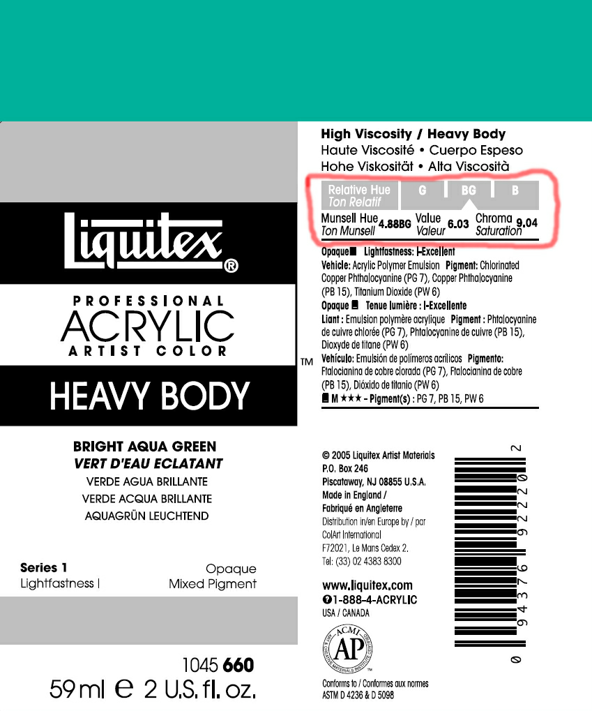
Artist paint manufacturer Liquitex prints a Munsell specification on the labels of its paint tubes. In the HVC model, the strongest examples of each hue often differ in their values (V). This can make difficult to recall the specification for, say, a bright orange, because one has to think carefully to recall its value. In the HPC model, in contrast, the strongest example of each hue is always in the middle row.
Each approach to colour specification has its supporters, and the debate between them is endless. Supporters of the Munsell, HVC approach argue that this is closest to the way the eye and brain work, evaluating tone value separately from Hue and Chroma. Supporters of the Ostwald, HPC approach argue that a painter who wants to specify a colour with which to depict a bright green tree, say, will think immediately of bright green paint, not a paint of a certain value. So Ostwald claimed that his approach was psychologically superior to that of Munsell, even though Munsell’s approach was better adapted to the scientific measurement of colour responses.
The practical artist and art lover do not need to take sides in this debate. The response of the human eye and brain to light is so complicated that no single system has described it to the satisfaction of all concerned.
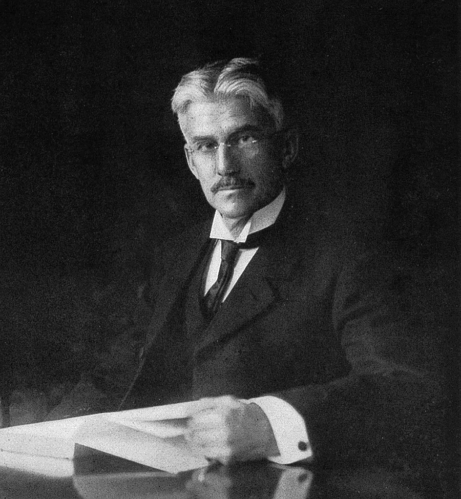
American painter, teacher of art, and the inventor of the Munsell color system.
As a painter, he was noted for seascapes and portraits.

Portrait of Mrs. Orr
Oil on Canvas
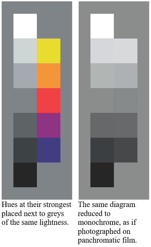
‘Tonal Value’ has a slightly different meaning from ‘Tone’. Colours are said to share the same tonal value when they are equally light or dark. The term Value is often used on its own to refer to Tonal Value.
At their strongest, some hues are lighter than others. For example the yellow in the diagram at left is as light as the palest grey, while the blue is as dark as the darkest grey. Other hues at their strongest fall in between these extremes. A monochrome photograph would represent each of these strong colours as a grey of the corresponding lightness, if it were taken on a modern ‘panchromatic’ film. Early photographic materials translated red into a very dark grey or black. More recent photographers sometimes make the translation inaccurate for aesthetic effect.
The dark colours are said to exhibit a low ‘value’ and the light ones, a high ‘value’. This term became particularly widely used by those American and British artists who studied in Paris in the latter part of the 19thC, where the French term “valeurs” was in frequent use.

HUE – PALENESS – CHROMA
This diagram shows 125 colours (not counting the repeats of the neutrals).It shows 12 Hues, at 7 steps of Paleness (including the neutrals) and 4 steps of Chroma from neutral to as strong as possible (within the limits of printing ink). It may be called the HPC colour model.Whereas the previous colour chart resembled the way in which watercolourists might think about mixing colour, this one is closer to the way in which oil painters might think – and others who use opaque media such as gouache and thick acrylic.
Adding white or black not only lightens a colour but reduces its chroma – in other words makes the colour weaker, softer, or greyer. This chart places all colours of the same chroma in the same column.Here each square shows a different colour (apart from the neutrals which are repeated). But some writers use the word ‘colour’ to mean only Hue and Chroma. This usage occurs in the computer image-manipulation programme, Adobe Photoshop. In that context all the swatches in each column are said to show the same colour (that is, the same Hue and Chroma).This arrangement is similar to that used in the Swedish Natural Colour system (used by Dulux household paints), and before that by the German colour theorist, Friedrich Wilhelm Ostwald.
The triangles are similar to those in the HPC model.
Here Ostwald arranged them so that a grey scale forms the central axis of a solid.

Friedrich Wilhelm Ostwald ( 1853 – 1932)
German chemist.
He received the Nobel Prize in Chemistry in 1909 for his work on catalysis, chemical equilibria and reaction velocities.
He wrote, The Color Primer, 1916

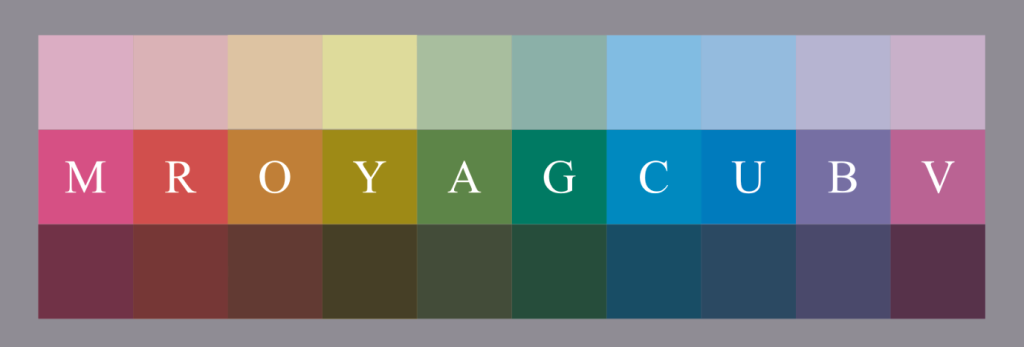
TINTS are the colours which are made by mixing the strongest example of a hue with white.
SHADES are the colours which are made by mixing the strongest example of a hue with black.
TONES are the colours which may be mixed between the tints and shades. The range of tones of green that may be mixed in this way is enormous. A colour may be made more eye-catching not only by changing its hue in relationship to those around it, but by increasing its paleness or strength. Similarly, a colour may be made less eye-catching by decreasing its paleness or strength.

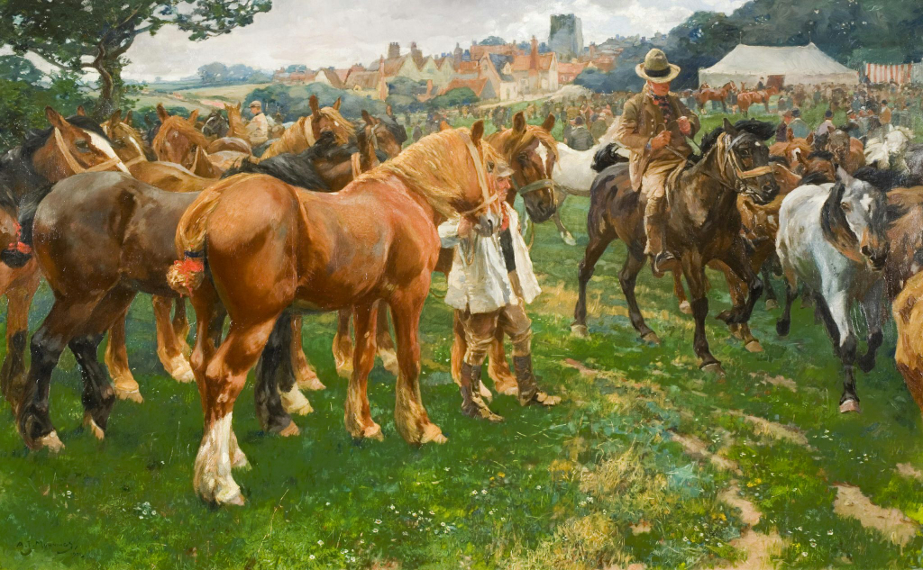
Green is a particularly difficult colour to judge because there are so many varieties , Misjudging the tone can make the green appear to jump out at the viewer, spoiling the illusion that it represents grass on the solid ground. This is why estimating the tone of grass gave Munnings so much trouble.
In the examples below, adjusted copies of a painting by Munnings show what happens when above the tone of the green has been misjudged.
THE DIFFICULTY IN JUDGING TONES

Alfred James Munnings (1878–1959)
The Munnings Art Museum
Oil on canvas 50 x 80 in

Munnings wrote:
LAVENHAM HORSE FAIR
I have told of a water-colour, “A Suffolk Horse Fair “, which I sold for twenty-five pounds, and how I boasted of its sale on one of my visits to the artists in the room at Page Bros. (‘Four of those, Alfred, make a hundred quid,’ said one of them.)This water-colour was the design for my first big canvas, eighty by fifty inches. Fools rush in where angels fear to tread. Painting so large a picture from a water-colour was asking for trouble. I worked away at it all through the winter. The tone of the grass gave me the same trouble as it does to-day. I was wretched. But my worst hindrance was the roan colt coming out of the picture. That ambitious effort should have taught me my limitations. I found it skied* in the last room of the Academy. Now it is hanging in the Norwich Art Gallery**, presented by a kind donor who bought it from someone who bought it from me for a song.
A note from
*‘Skied’ means hung high up on the wall – nearer the sky than would be ideal for viewing.
**The painting from this period which is now hanging in Norwich Castle Museum is not this one, but ‘The Horse Fair’ (1904).
Sir Alfred Munnings
AN ARTIST’S LIFE First published 1950
CHAPTER XXVIII
a leading member of the Norwich school of artists. (In this sense ‘school’ means group, not an educational institution).Demonstrating attention paid to values, tones and shadow shapes which Munnings teacher made him see.

Known as one of England’s finest painters of horses.
In Munnings’ day, the Norwich School of Art occupied the upper floors of the Free Library.
‘… Again a kind man’s face comes forward from all those of the past as I seek him out. He was the Headmaster, Walter Scott, an honest soul if ever there was one ; perhaps more often in my mind than any other friend of that period, for he made me see values, tones and shadow shapes.
” Munnings,” Scott used to say, ” whatever you do, remember the tone.”’
Sir Alfred Munnings
AN ARTIST’S LIFE First published 1950

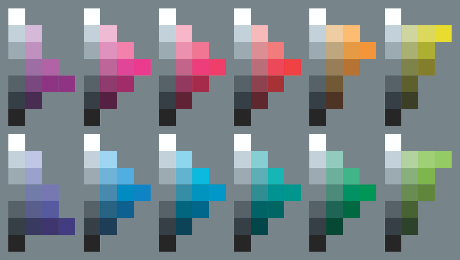
HUE – BLACKNESS – DILUTION
This chart shows colours as a watercolourist might think of them. Each group of 20 squares represents a single hue. The hue varies horizontally in blackness, and vertically in dilution (with water in the case of watercolour). The could be termed a Hue, Blackness, and Diluteness chart (HBD).At the bottom right of each hue group is the strongest example of that hue. This colour is mixed with black (C+M+Y) by stages until pure black is arrived at at the bottom left.
In practice some watercolourists prefer to add a black pigment rather than a combination of (C+M+Y). Others prefer to add a complementary colour. In principle the result is the same – a combination of (C+M+Y).
THE NUMBERS OF STEPS USED IN A DIAGRAM IS ARBITRARY –
ANY NUMBER COULD BE USED.

Here a strong red is combined with greys.
The strong red is mixed with white in steps, and similarly with black.
Apart from the neutral greys, all the colours here share the same hue. They are all examples of the red hue.
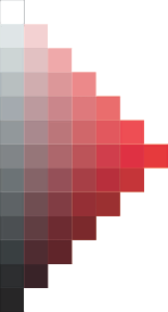
The number of steps may be increased ad infinitum. In practice a painter would be unlikely to mix so many separate samples. Samples would merge together on the palette as seen in fig. X