THE TWO COMPONENTS OF ARTISTIC STYLE.
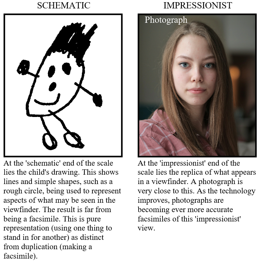
“…all representations can be somehow arranged along a scale which extends from the schematic to the impressionist.”
E. H. Gombrich (1909-2001), Art and Illusion (1959), Chapter IX .
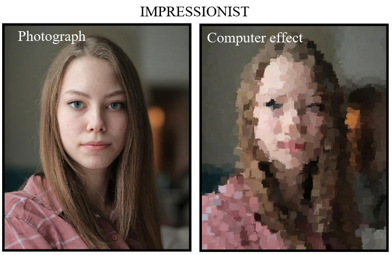
The French impressionists, like Pissarro (below) imitated certain aspects of this ‘impressionist’ image. Part of the intention was to replicate what might appear in a viewfinder, but reduced to flat patches of colour. This kind of simplification may be imitated by applying a computer ‘effect’ or filter (above).
The example above shows what happens when one of the many ‘brush stroke’ computer effects is applied to a photograph. The result is no nearer the schematic end of the scale than the photograph, because no schemata, such as lines and circles, have been introduced. The image remains a pure record of what appeared in the viewfinder, even if degraded or distorted.
(It hardly needs saying that there is more to an Impressionist painting than this sort of recording. For example, the areas in Pissarro’s painting below are made of line and shape, in a way which could not be imitated by applying a computer ‘effect’).


This sort of analysis is beyond the power of a camera, and even beyond the power of a computer.
A photograph is sometimes referred to as an ‘impressionist’ image – a facsimile of what appears in the viewfinder at a certain moment. (When applied to the French Impressionist painters, the word ‘impressionist’ has a slightly different meaning).
Sometimes a photograph may be made more interesting by simplifying it in various ways, for example by applying ‘effects’ on the computer. These effects require only that the person who is operating the computer should click on certain controls: very little mental effort is needed. An ‘effect’ reduces the amount of detail (or ‘information’) in the photograph so in that sense it degrades the photograph. An effect does not add anything to the image.
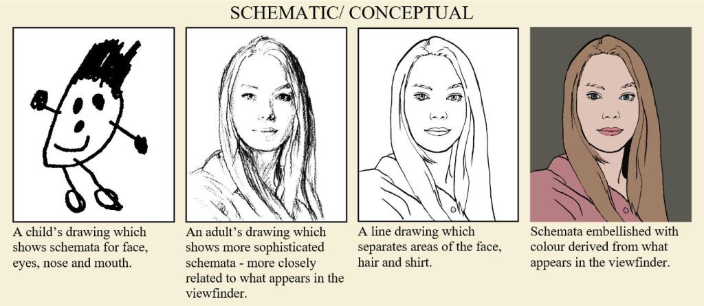
In contrast to this is the image which is ‘schematic’. This may be simple when drawn by a child, or more sophisticated when drawn by an adult. Whereas the photographic/ impressionist image depends entirely on what appears in the viewfinder, the schematic image depends entirely on the artist. The schematic image can be totally invented, or it may correspond with some aspects of what appears in the viewfinder. Either way it is generated by the artist, not by what appears in the viewfinder.
The character of schematic representation develops and changes over the years – for example, heads are sometimes indicated by flat, oval shapes, sometimes by solid-looking egg shapes. In contrast, the character of photographic images never changes. Photographs remain dependent on the scene, just like mirrors – which can only reflect what is placed in front of them.
The schematic image is usually combined with elements of the impressionist image, giving rise to an immense range of possibilities. In this way the schematic image adds to the amount of information contained in the final picture, rather than taking away from it in the way that a computer effect does.
BALANCE BETWEEN IMPRESSIONISTIC AND SCHEMATIC

A purely impressionistic approach would have resembled a photograph to which a computer effect had been applied. In practice, the French Impressionists did not paint with this sort of purity. In the example above, Berthe Morisot (1841 – 1895) used brushstrokes which show the limits of the areas of hair, face and shirt in a way that a pure impressionist effect could not. In this sense, the brushstrokes are schematic. They sweep around the form of the head, hair, and body, giving some sense of solidity and movement.
I have drawn lines to suggest the direction of some of these brushstrokes. No doubt when Morisot worked on this painting she did not make a strict separation between schema and impression. The two elements combine seamlessly into a single, coherent approach.
STYLES IN PAINTING A TREE

So far, the examples I have shown have been representations of people, but the same principle applies to the depiction of all objects. Representations of trees, for example, can be placed on the same schematic to impressionist scale as other subjects. The ancient painters at Pompeii had given maximum emphasis to individual leaves, but over the centuries artists moved towards a more general impression of foliage. Then, after the French Impressionists, many artists began to move back in the opposite direction, making their work more schematic.
In contrast to all these changes, the light coming from a tree has remained the same for all of us, (supposing the tree to be unchanged, and the weather to be the same). What would appear in a viewfinder has stayed the same during all these centuries.

Sketch of horses and trees
The trees are represented by schematic scribbles which look nothing like a photograph, and yet are instantly recognisable as trees.
What is satisfactory as a representation can vary enormously between individuals. Many people have their favourite place on the scale between schematic and impressionist. This was made strikingly apparent during a famous speech which Sir Alfred Munnings made in 1949, when he was resigning as President of the Royal Academy (PRA).
“If you paint a tree – for God’s sake try and make it look like a tree…” he pleaded. When he said this, Munnings cannot have had a photographic match in mind. He himself painted with patches of colour, similar to those of a French Impressionist, and even used scribbles in quick sketches (above), but for him there were limits as to how far a painter might depart from what might appear in a viewfinder. Munnings singled out for particular censure a painting by Matisse called, ‘Le forêt’.

Nu dans la forêt 1906
For Munnings, these extremely schematic depictions of trees were inadequate as representations.
MAKING NEW STYLES OF PAINTING

The move along the scale from schematic to impressionist does not always happen in one direction. Constable, for example, progressed from painting an image that was very impressionistic (or photographic) to one which was more like that of the French Impressionists (a degraded photographic image). After that, he went on to make his rendering more schematic.
Constable learnt to represent the Suffolk landscape by copying and imitating Dutch paintings. The Dutch had gone further in the direction of true-to-life depiction than anyone up to that time. Constable soon began to rival them, painting the colours of reality with great accuracy, but this was not enough for him. He turned his attention to something novel, the depiction of noon – a time of day which the Dutch had neglected.

The Hay Wain 1821 – National Gallery, London
Constable extended the range of natural painting. He made the brushstrokes more obvious, and the highlights more abrupt and sparkling.
This novel subject, midday light with its brilliance and sparkle, demanded a treatment that was equally novel. He replaced the smooth brushwork of the Dutch with the more varied brushwork of Titian, even applying abrupt touches with his palette knife. He had fully developed this approach by the time he was 40, and it culminated in his painting known as The Hay Wain. This was the first major painting to represent a landscape at noon. It made a powerful impact on a public accustomed to less sensational works. Constable had gone even further than the Dutch.
For Constable, the most important quality in a landscape was the distribution of light and dark, or ‘chiaroscuro’ as it was called– a term which he mentioned frequently in his writings. This is the quality which he had displayed perfectly in The Hay Wain. But this achievement did not satisfy him for long. He carried on seeking out ways in which to make his pictures yet more striking.

Hadleigh Castle 1829
Constable made it ever clearer that his brushstrokes represented the effect of light and colour, but at the same time they represented objects, such as the man and the dog.

The Death of Acteon c 1559/76
By the time he was 60 Constable had increased the contrasts of his light and dark, and made his brushstrokes even more varied and eye-catching – going further even than Titian had gone. The chiaroscuro in Hadleigh Castle (above) is more dramatic than that in any previous work. The picture is serious and moody, even tragic, but there is a playfulness in the painter’s use of the elements of representation – the colour, the light and shade, and the brushwork. Constable took ever greater risks, discovering how far could he go in splitting up the paint surface, while still maintaining a unity of effect.
Many artists develop in this way. First they learn by copying other painters, just as children learn to speak by copying grown-ups. As painters learn to handle the elements of representation, they also experiment with varying the amount that these elements contribute to the final effect; they might make the brushwork smoother, or rougher; or the colours brighter or duller. In this way new styles of painting come into being.
THE LIMITS OF REPRESENTATION
Van Gogh was a very different painter from Constable, yet his approach to learning was similar. Where Constable took colours from the Dutch, Van Gogh took colours from the French Impressionists. He made their colours stronger, and combined them with the type of outline that he saw in Japanese prints, thus producing a novel style of his own. Constable and Van Gogh were taking ever more daring risks in the game they were playing, finding new and surprising ways in which to make a painting represent the visible world, whether real or imagined.


Les Alpilles, Mountain Landscape near South-Reme 1889
Here van Gogh has given more emphasis to the outlines.
During the course of the 20th century many artists continued to seek new means by which to surprise the viewer. Some placed so much emphasis on the pattern of colour that their paintings became totally abstract – it was impossible to see what they represented, if anything. Others directed their attention to theoretical concerns, by presenting the viewer with quasi-philosophical conundrums.
By stretching the art of representation to these extremes (with pure arrangement of coloured shapes at one end of the scale and pure thought at the other), these artists were no longer wrestling with the problem of how to produce novel representations. They had given up the game of representation: they had left the playing field.

But the game carries on, simply because so many people find it fascinating. Even a child can be a player.
The child’s drawing shows a multiplicity of ideas about what has been looked for, and what has been observed. Adults’ drawings may be more sophisticated, but they are based on the same principle – drawing a line to stand in for something real or imagined. Artists continue to find new variations within the range of possibilities, just as Constable and Van Gogh had done in previous centuries.
REPRESENTATION COMES BETWEEN THE EXTREMES
This complete sequence shows a range of points between the extremes.
Individual pictures are repeated below for easier viewing.
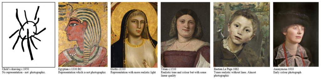
The range of possibilities may perhaps best be appreciated by imagining a scale of representation stretching from non-representational abstraction at one end, to perfect verisimitude at the other. A tiny child’s scribble would be at one extreme, and a photograph at the other.
An Egyptian tomb painter may be thought of as working near the symbolic end of the scale, like a child; while a ‘Plein Air’ painter such as Bastien Lepage may be thought of as working near the photographic end.
An early Renaissance painter may be placed somewhere in the middle of this scale; more photographic than the Egyptian, but less photographic than Bastien Lepage.
A representation may be made at any point along the middle of this scale. At the furthest extremes – the meaningless scribble at one end, and the pure photograph at the other – no representation takes place. A photograph does not represent anything – being as near as possible a duplicate of what appears in the viewfinder; and neither does a meaningless scribble represent anything – (even though, with some imagination, it may be pressed into service as a representation).

No representation – not photographic.

Representation which is not photographic

Representation with more realistic light and shade

Realistic tone and colour but with some linear quality

Tones realistic without lines. Almost photographic
Early colour photograph
LINE SHOWS WHAT TO NOTICE

Art Students’ Anatomy
Features in the photograph are easy to overlook until they have been pointed out, and yet they form an essential part of the structure of the figure.
The lines help the viewer become more aware of the lumps and hollows on the model.
As art teachers sometimes say, there are no lines in Nature. ( ‘Nature’ in this case means whatever might appear in a viewfinder). The artist gives the viewer lines to contemplate, not the thousands of tiny variations of tone and colour which exist in reality. A linear drawing is clearly different from Nature, but it is this difference which is so informative.
Lines tell the viewer what to notice. Fig. 110 shows this in the simplest way. The lines in the drawing help the viewer notice the bumps and hollows on the model. It is this type of analysis (differential analysis, as the photographer, P .H. Emerson, called it) which is the essence of representation, whether in a simple line drawing, or in its extension into patches of colour. A meaningless scribble cannot display such analysis, neither can a photograph.
Rather as a writer has words with which to construct a poem, so an artist has coloured shapes with which to construct a painting. These shapes may be brought together in a large variety of combinations, all of them offering possibilities for new and surprising results. But representational painting is not solely about putting coloured shapes together in a surprising way, any more than poetry is solely about putting words together in a surprising way. Each new combination of shapes has an emotional effect on the viewer, partly because of the choice of subject, and partly because of the way in which that subject is represented.
HOW TO KNOW WHEN A PAINTING IS FINISHED
This introduction has touched on the contrast between an image which is a facsimile and one which is constructed from lines and coloured shapes. The implications of this for the practical artist and for the viewer form the main subject of the rest of the book. Philosophers have wrestled with the same problem, often expressed in terms such as: ‘Is it true that the art of photography is extremely limited when compared with the art of painting?’*
* The philosopher, Roger Scruton (1944-2020), dealt with a related topic in a famous essay, Photography and Representation, (1981). He pointed out that a photograph is a copy, not a construction. This meant that, as an art, photography could only be very limited – very much as the photographer, P. H. Emerson, had pointed out in 1890.
This may be an intriguing subject for a professor who can sit back in his or her armchair and discuss the issue with a few students over a glass of sherry; but, for the practical artist, the problem is more urgent. He or she needs to know when a painting is finished.
The artist Solomon J Solomon recalled an anecdote about finish, concerning the artist, Leon Bonnat (1833 -1922):
When M. Leon Bonnat was asked by a pupil who thought he had completed his study what he was to do next, his reply was : “Make it more like.” “And then?” asked the pupil. “Then make it still more like !” was the retort.
Solomon, J. Solomon (1860 – 1927)
The Practice Of Oil Painting 1910
Logically, a student who pursued this path for long enough would end up with a painting which was so detailed that it resembled a photograph. This would not have been worth the effort. Feeling scared of arriving at this unsatisfactory result, many artists simply leave their work unfinished. (‘Don’t overwork it!’ they say).
It is true that an unfinished work is bound to be more lively than a painting that looks like a photograph, but that does not really solve the problem of how to know when to stop.
A quick look at some famous paintings shows something important. Some are highly detailed and some are not, so the amount of detail cannot be the deciding factor in determining when a painting has been finished. But they all give a sense of balance or resolution, as if all the parts fit together nicely. Or, as a fellow student once expressed it, “They look happy”.

Reclining Woman

A Roman girl at a fountain 1875
This pose would have been impossible to maintain for the long periods required to paint this amount of detail.
Bonnat must have depended more on memory and imagination that it may seem at first sight. Making the painting ‘more like’ was clearly not as simple as it sounds.

Man with a glove (detail)
This painting takes its place towards the impressionist (photographic) end of the schematic/impressionist scale. It is relatively highly finished in that few brushstrokes are visible.
But the grouping of tones and the firmness of outline give this painting simplicity and power – a feeling that the painting is resolved – even though it would have been possible to have added even more detail.
DECORATION AND ILLUSTRATION

These paintings show a number of elements that are held in balance, the main two being decoration and illustration. Decoration, in this context, means an arrangement of lines, shapes and colours. The artist combines and adjusts these until the arrangement looks balanced or satisfying – rather as one might arrange a vase of flowers. Even individual shapes can give the viewer a sense of rightness or completion.
But these lines, shapes and colours also act as representations, standing for objects either real or imagined. In the most impressive paintings, the artist keeps the elements of decoration and illustration in perfect balance. They are interdependent.
This is summed up in an old definition:
A painting is an illustration in the form of a decoration.
There is no implication here that illustration is better than decoration or vice -versa. All representational paintings incorporate both elements.
When an artist has developed a painting into a work which is both satisfying as a design, and convincing as a representation, the work may be declared finished (though ‘resolved’ is perhaps a better word). If the representational element is the more noticeable, the work is known as ‘illustrative’; whereas, if the decorative element is the more noticeable, the work it is known as ‘decorative’. So these terms, ‘illustrative’ and ‘decorative’, may be used either as praise or as blame, depending on what the viewer demands of the painting.
For example, looking at painters born around 1860, Frederic Remington (1861 – 1909) tends to be illustrative, while Klimt (1862 – 1918) tends to be decorative. Sickert (1860 – 1942) came close to achieving an even balance. Bonnard (1867 – 1947) also came close, though tending towards the decorative. In the history of painting, a perfect balance has only rarely been achieved. Michelangelo and Titian arguably provide the finest examples – each in his own way producing works which perfectly resolve the demands of decoration and illustration.
So a painting is complete when the balance between decoration and illustration has been achieved within the artist’s style, (and this style may be placed somewhere on the scale from schematic to impressionist).
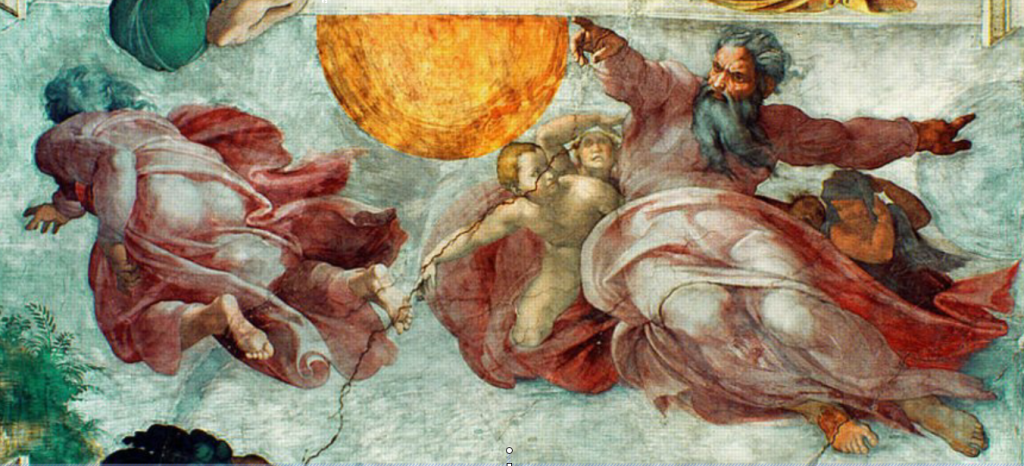
The Creation of the Sun, Moon, and Plants. 1511 Sistine Chapel
The painting acts as an illustration for the story, showing the figures clearly, but it also conveys volume and movement for their own decorative value.

The Entombment. 1559
As with the Michelangelo, this picture acts as an illustration for the story, showing the figures clearly, but it also provides ‘masses’ or areas of colour and tone for their own decorative value.
DISTORTING REALITY
If aware of these possibilities, a viewer can appreciate a sense of pictorial resolution just as much as an artist. This was bought home to me when I was a schoolboy. An older boy returned from hitch-hiking in Spain, where he had visited the Prado, Madrid. He declared all the paintings there to be rubbish – mere substitutes for what photographs could have done better. Only the work of El Greco had met with his approval, because it was so clearly a distortion of real life.
I was shocked that he could so easily dismiss the work of Titian, Rubens and Velasquez, let alone that of all the other marvellous painters whose work hangs in Madrid. Looking back, I think he had simply not known what to look for. He had not been aware of the complexities involved in making work which takes its place towards the impressionist end of the schematic/ impressionist scale.
In the pages that follow, I hope to bring some of these complexities to the foreground, at least for a short time, and so to help in an appreciation of that ‘solid science’ which, as Reynolds said, provides the foundation for all great pictorial representation.
The Resurrection
This shows elongations which ensure that the painting cannot be confused with a photograph.

Portrait of a man (detail)
Even in heads, El Greco was able to introduce distortions, though not as strongly as in his figures.