For Emerson, the fatal flaw in photography was that it could not display what he called ‘differential analysis’. But surely all analysis is differential? So why did Emerson insist on adding that word?
Perhaps he wanted to distinguish between the sort of analysis that is performed automatically from that which depends on perception. For example, a computer can divide an image into tone levels (using a ‘posterisation’ effect or filter). But while a computer can measure tone values, it cannot determine what they represent. In order to do that, the computer would have to be able to distinguish between tones which show where an object ends and those which do not.
Compared with measuring tone values, recognising objects is a much more complicated task, even though a human being can carry it out almost instantaneously. A human being can draw lines around objects, but a camera cannot.
As we have seen, if a painting matches the image-in-the-viewfinder perfectly, it may as well be a photograph: it cannot display differential analysis. But in practice it would be impossible for any artists to operate quite like this, even if they wanted to. One has to start somewhere, and that start has to be a schema of some sort, however rudimentary. Children’s pictures display these schemata very clearly. It is only when the painting becomes so elaborated that it closely resembles a photograph that the underlying schemata may become undetectable.
Making a painting that looks like a photograph requires tremendous skill, but it is a skill which is athletic, not artistic. Such a finish indicates that the artist has not taken the trouble to prioritise, to think about what he or she wants the viewer to notice.
This is why artists who work from photographs are often so keen to claim that they do not simply copy the photograph. An artist who admits to having simply copied a photograph admits to having done what a machine could have done better. In order to avoid this accusation many artists who are really nothing more than copyists deliberately mess up their copies, in the hope that their lack of vision will be obscured.
These are three ways in which artists can demonstrate that they are not simply copying, starting with the way which incorporates the highest achievement.
1. Complete differential analysis. (The best way). For example a Michelangelo is highly finished, but is also clearly different from a photograph. The artist tells the viewer something physical – here is a cylinder, here is a sphere, and so on. The artist displays elements of Line, Form, Tone or Colour, either in isolation or in any one of the infinite number of combinations that are possible.
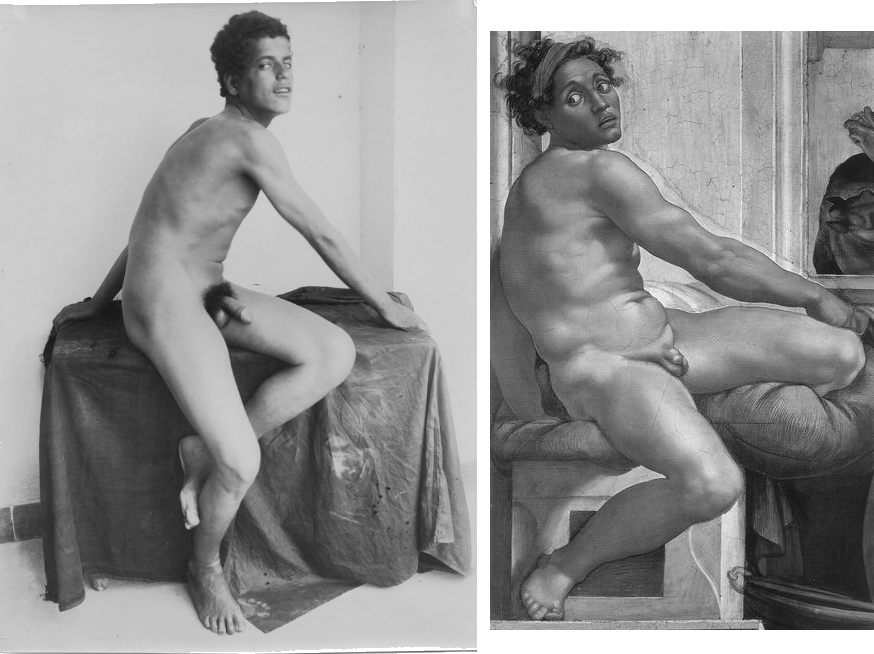
Michelangelo (1475 – 1564)
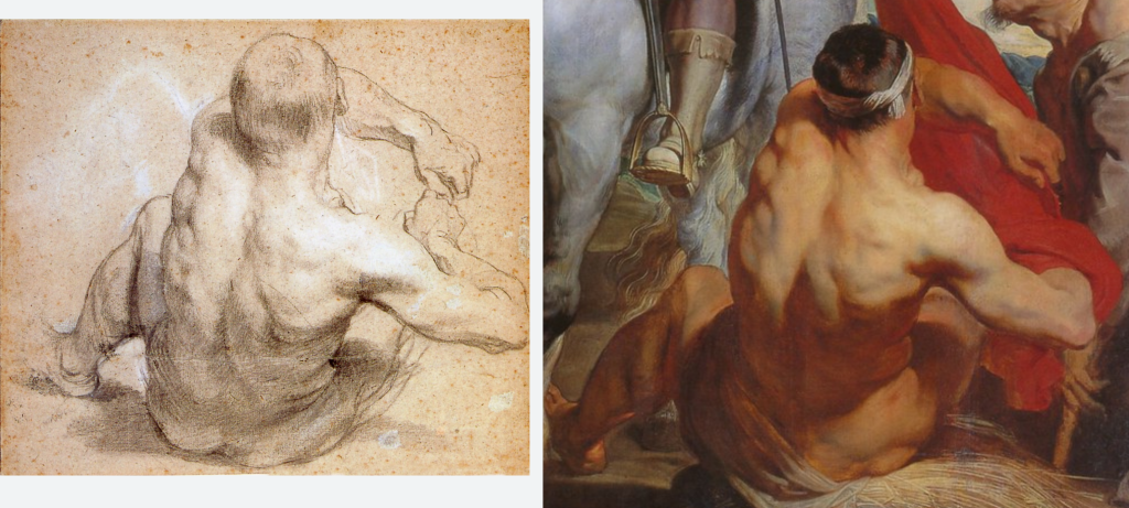
Plüschow’s model was not as muscular as the athlete Michelangelo depicted; but, even so, the comparison shows how much Michelangelo simplified, or rather re-invented, the figure in terms of clear volumes. He did not make a literal transcription of the scene, but a translation into schemata.
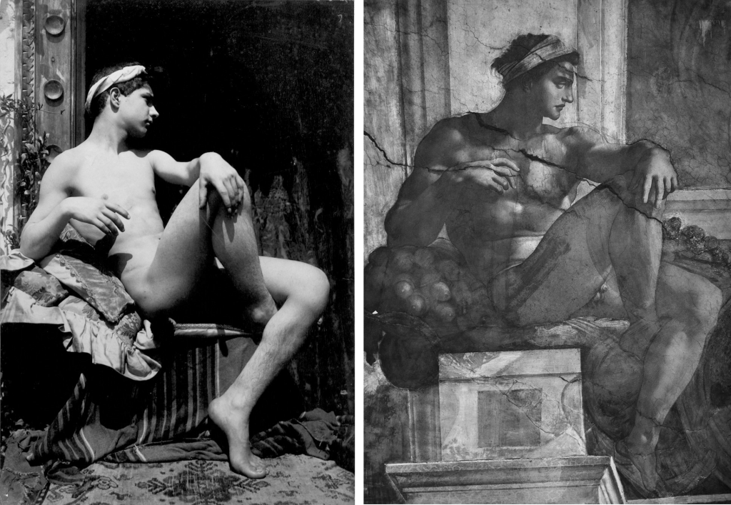
Michelangelo (1475 – 1564) – from Braun’s photograph c 1869
Even though Plüschow’s subject is lit differently from Michelangelo’s it is possible to observe how Michelangelo outlined the forms – a basic kind of differential analysis which was unavailable to Plüschow.
2. Incomplete differential analysis. (Not the best). Leave the painting unfinished. This allows the viewer to gain some idea of the thought process which brought the picture to its current state.
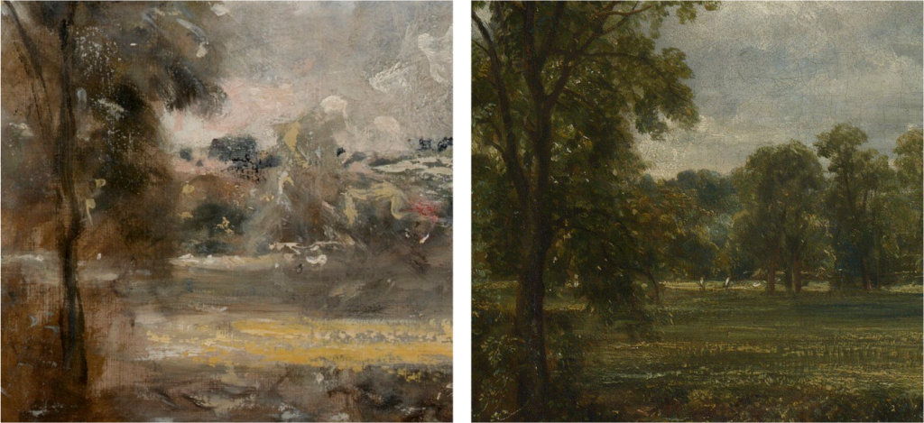
However this may mean that the painting does not have a sense of completion or resolution – the feeling that everything fits into place in a satisfying way. The artist may have demonstrated his or her schemata, and that may well capture the viewer’s imagination. Sketches are frequently more immediately appealing than their more finished counterparts. As Delacroix pointed out, it takes a lifetime to learn how to make a finished painting as lively as a sketch. (In fact few artists manage this – even after a lifetime of struggle).
But there is more to art than liveliness. The Hay Wain, for example does not have the liveliness of the large sketch which Constable (1776 – 1837) made for it, but the composition is better – the parts of the painting lock into place in a way which they do not in the sketch.

3. False differential analysis. (unsatisfactory). On a computer, ‘filters’ and ‘effects’ may be applied which split up the image in predetermined ways. They can emphasise the edges of tonal areas, or exaggerate contrasts. There are numerous variations. These effects can be produced both on the computer, and by hand with paint. None of these filters or effects is concerned with representation. They do not demand so much of the mind (even though the physical skill needed to imitate such an effect by hand may be considerable). The level of thinking is much lower than that involved with schemata because it is concerned with applying a set of rules rather than inventing a new construction. To the casual observer, such effects may give the false impression that the artist has demonstrated differential analysis.
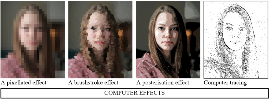

Such computer effects have much in common with what is known in architectural drawing as ‘rendering’. That is, if there is a dark area, say, this may be indicated by a substantial amount of shading. This shading may be carried out in numerous ways: all the lines may be in the same direction; or they may cross over each other in patterns; or stippling with dots or dashes may be used instead.

As far as artistic quality is concerned, the manner in which this shading is carried out is of no importance – any method is as good as another. What is important is where the artist has placed the shaded area – its shape and darkness relative to the rest of the drawing.
Some call the choice of rendering the ‘style’ of the drawing, but it is better called a mannerism than a style, because it is not concerned with the structure of the drawing but with an unimportant effect. When the viewer’s eye is directed more to this manner than to the substance of the work, such finishing is known pejoratively as ‘tarting-up’ or ‘titivating’.
It is true that such titivation is not entirely without merit. If very obtrusive, it can make the subject less recognisable than it appears in a photograph. Then the struggle to make out what is depicted can stimulate the viewer’s imagination. But the most intriguing paintings result from much higher levels of analytic thought (even when done crudely by a child, whose schemata are extremely obvious). With more sophisticated artists these schemata may be partially obscured, as when outlines are lost in shadow, but (as in the Van Dyck below) the viewer is never left in doubt that the artist is working at a high level of differential analysis, even though he might also be playing a game of hide and seek with the viewer.
EXAMPLE OF DIFFERENTIAL ANALYSIS IN VAN DYCK
At left, a drawing which Van Dyck made in preparation for the painting.
The modelling (the way the protrusions of the body fit together) is easier to see in the drawing than in the painting, where the colouring and the massing (the large comparatively flat areas of tone and colour) take attention away from the modelling.
Nevertheless, the firm analysis shown in the drawing is still clear in the painting, as long as the viewer looks out for it.
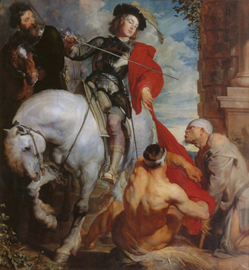
St. Martin dividing his cloak (1618) – Zaventem, Belgium
A small image of the whole painting to show where the detail comes from.