“Pure photography is a scientific method of drawing, and scientists should work on until a true and literal transcript of nature can be made – this by orthochromatics, etc.”
P. H. Emerson, The Death of Naturalistic Photography, 1890.
What P. H. Emerson meant by “Scientific photography” is demonstrated in a photographic reproduction of a painting. If the match is perfect, the photographic print is scientifically accurate.
Scientists have devised ways of ensuring that such a match it as near perfect as the technology allows. A full explanation is outside the scope of this book, but there is plenty of information available on the Internet, for example on the website called, “Handprint”.
https://www.handprint.com/HP/WCL/color6.html
For practical purposes it may be worth mentioning an effective way in which an amateur photographer can make a very accurate copy of a painting.
I wrote a description for ArtwatchUK here:
http://artwatch.org.uk/the-national-gallery-londonthe-world-leader-in-museums-online-provision-of-photographic-reproductions-of-paintings/
and a fuller explanation here:
http://artwatch.org.uk/destroying-archives/
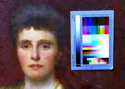

The painting is now reproduced with very great accuracy. The colours do not depend on the opinion of the editor, but on the response of the standard human observer.
The photograph now shows the effect of discoloured varnish on the painting.
In essence, if the photograph of the chart is colour-accurate, the photograph of the painting will also be colour-accurate. Certain pigments, such as cobalt blue, may not always be matched correctly, at least with older equipment, but this sort of problem has greatly diminished as the technology has improved. The degree of scientific accuracy now possible, even to the amateur, would have thrilled Emerson.
Software which will ensure that a colour chart is adjusted correctly is available here, free of charge:
https://www.dl-c.com/site/products/buy-pm.php/
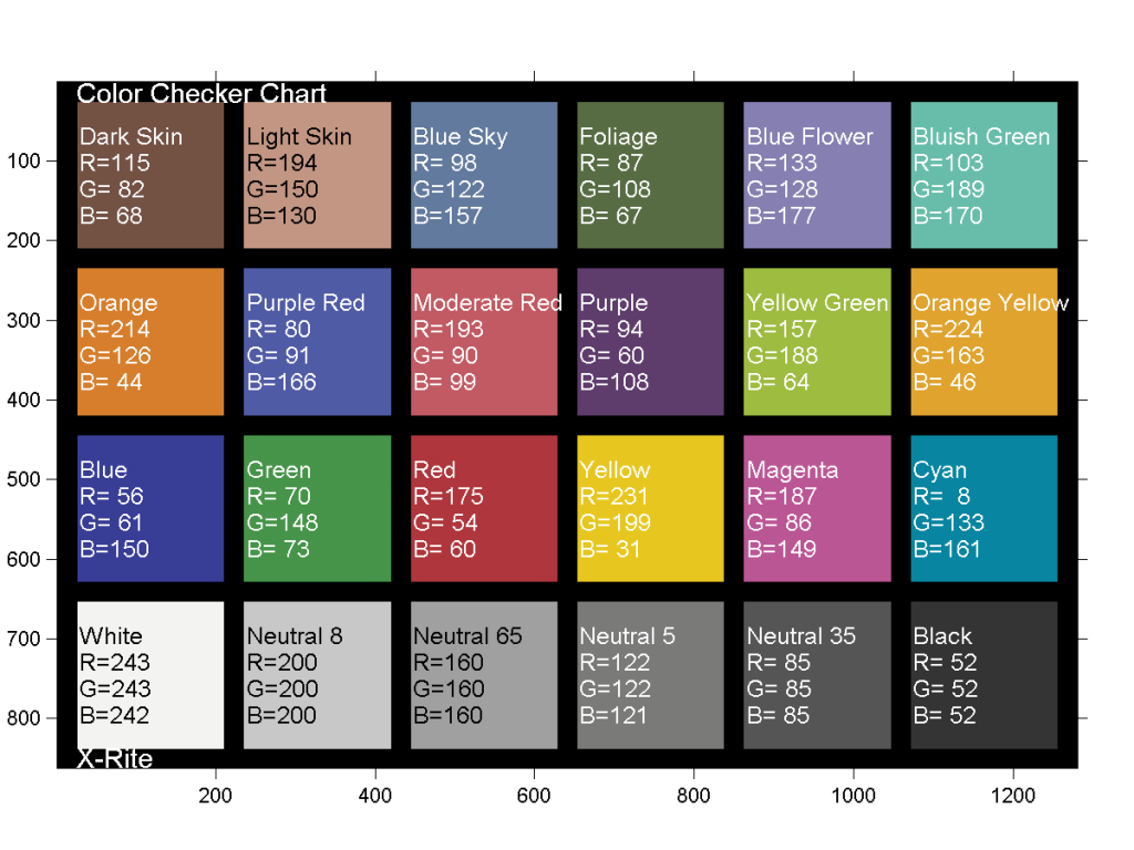
The establishment of an international standard for measuring colour meant that photographic equipment could be made which would reliably produce the same colour when given the same input. This group responsible for this standard is called the “Commission Internationale de l’éclairage” (CIE), known in English as the International Commission on Illumination.
Here is another popular chart with the colour specifications written on it. This is the Gretag/Macbeth 24 patch colour chart. Similar charts are made by a number of manufacturers. Older charts have slightly different colours from recent charts, so the readings vary slightly. Keen photographers usually take their own spectrographic readings to ensure maximum accuracy.
HIGH DYNAMIC RANGE PHOTOGRAPHY AND PAINTING
An accurate photographic copy of a painting is a good example of scientific photography. Such accuracy is possible because there is nothing lighter or darker in a painting than there is in a photographic print. This is not true of many outdoor subjects. Here light parts of the scene can be very much brighter than dark parts. The range from light to dark, the so-called ‘dynamic range’, is greater in the scene than is possible to reproduce accurately in the photograph.

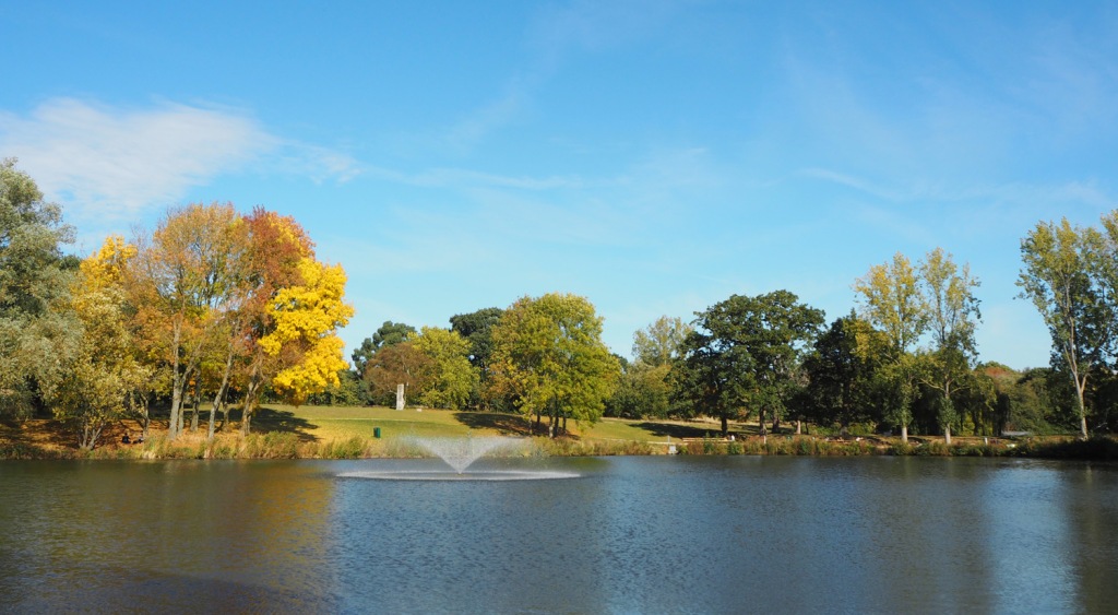
In 5, a balance has been struck by combining all 4 images. Both the lights and the darks look reasonably correct, even though they are not scientifically accurate.
https://www.cambridgeincolour.com/tutorials/high-dynamic-range.htm
SCIENTIFIC PHOTOGRAPHY NOT SATISFACTORY TO ALL VIEWERS
Photograph courtesy of the University of Essex
This illustrates how a photograph captures far more detail than a great painting, and yet the painting points out coloured shapes to look for in a way that is impossible in a photograph.

Wivenhoe Park, Essex 1816
A painting which is extremely naturalistic, and yet selects and emphasises a great deal about the scene. For example, the slight flattening of areas draws attention to how the scene has been translated into coloured shapes.

From E.H.Gombrich, Art and Illusion 1960
These shapes show what the child has noticed and thought important. The child has given more emphasis to the separate objects, whereas Constable gave more emphasis to shapes made by light and shade.
I have asked a child of eleven to copy a reproduction of Constable’s Wivenhoe Park. As expected, the child translated the picture into a simpler language of pictorial symbols. The copy is really a tidy enumeration of the principal items of the picture, particularly those which would interest a child – the cows, the trees, the swans on the lake, the fence, the house behind the lake. What has been missed, or much underrated, are the modifications which these classes of things undergo when seen from different angles or in different light. The house, therefore, is much larger than in Constable’s picture, and the swans are gigantic. The boat and the bridge are seen from above in that ‘conceptual’ maplike mode which brings out the characteristic features. The trees all have their trunks, the fence runs parallel to the edge and then turns back in an uneasy compromise between a scale model of a fence and a perspective rendering. Each object has its own and proper colour, the lake is dark blue, the lawn green, and such modifications as there are are due to impatience and accident rather than intention.
E.H.Gombrich
Art and Illusion 1960, Chapter IX part I
Gombrich described how, rather than attempting to achieve visual truth, the artist could be thought of as seeking to avoid falseness.
For example: if, say, the house in ‘Wivenhoe Park’ were painted as the child had painting it, an eye-witness, standing where Constable was standing, might point out discrepancies with the view. For example that a tree overlapped more of the house; and so a correction should be made. If the painting were corrected like this, again and again in every part, it would gradually become more accurate. By continuing to remove information which was false (from the eye-witness point of view), the artist would arrive eventually at a duplicate of the image in the viewfinder, something very like its counterpart, the photograph. In that sense, a photograph would show perfectly what we can really see – or at least, it would contain nothing false from the point of view of an eyewitness.
However, almost as soon as photography had been invented, people began to find fault with the images, even though they contained nothing false from the point of view of an eyewitness. Viewers noticed details in photographs which they would not have noticed in real life. So ‘Naturalistic photography’ was developed, in which parts of the picture were blurred to prevent them attracting too much attention. The demand that a picture should meet the ‘eye-witness’ criterion was now dropped in preference for the demand that a picture should not include details which were more eye-catching than they were in real life. But what catches the eye of one person may not catch the eye of another. Thus an objective criterion was being replaced by a subjective one. This was a process which in painting had already started with the French Impressionists, and was now being incorporated into photographic practice.