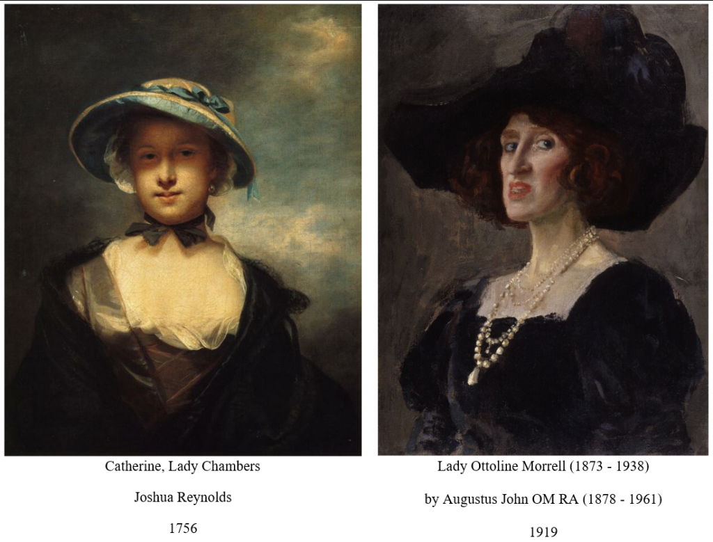
Sir Joshua Reynolds (1723 – 1792)
The paint surface is varied so that the light areas are highly textured, while the darks tend to be painted smooth and flat. This enhances the sense of depth, and tends to give the impression that one is looking at the scene through a window.
Reynolds made great play of the contrasts between lights, which are thick, textured and eye-catching, and backgrounds which are smoother and not so eye-catching.
Reynolds paid great attention to the varnish he applied after finishing the painting, so as to obtain as beautiful a gloss as possible. (Unfortunately Reynolds often used experimental varnishes which have deterioriated).
Augustus John (1878 – 1961)
The paint surface is less varied in texture than that of earlier painters, such as Joshua Reynolds. This throws more emphasis on the differences of colour between brushstrokes.
The relative lack of variety in the texture directs the viewer’s eye across the whole surface of the canvas. This increases awareness that the picture is a flat surface rather than a window through which a scene is viewed.
Augustus John maintained a more monotonous paint quality than Reynolds. By reducing contrasts in texture, John placed more emphasis on contrasts of colour.
Sometimes people ask the question: if all colours can be matched with the three primaries, why do manufactures produce such an extensive range of pigments?
The first reason is that a mixture made from primaries is not always as bright as the pigment which it matches closely. For example Magenta and Yellow mixed produce a red, but this red is not as powerful as, say, a cadmium red straight from the tube. This may be confirmed by placing some cadmium red paint next to a red shown in one of the colour charts in this book. The painted red will look much stronger than the printed red.
The second is that each pigment exhibits a particular degree of transparency or opacity. Even if its colour may be matched from the three primaries, the mixture may not show the same degree of transparency as the single pigment. A painter may sometimes wish to place a layer of paint which allows the layer beneath to show through – in which case he would use pigments which were transparent. At other times he may wish completely to obliterate what lies below – in which case he would choose pigments which were opaque.
The third is that pigments vary in covering power, and the painter can choose them according to the effect he wishes to produce.
The fourth is that each pigment imparts a particular quality to the paint, so that some paint may resemble putty in texture, for example, while other paint may behave more like butter. Some pigments are more granular than others (Canaletto chose a particularly granular type of blue for the sky in the Stonemasons yard, for example).
This texture, or ‘paint quality’, can be an important element in making a picture enjoyable to look at. Sir Joshua Reynolds wanted paint to resemble cream and cheese. Other, later painters have favoured a consistency which is thinner and not so luscious, but which gives more emphasis to flat pastes of paint placed next to each other.
There are other questions of paint quality which depend less on the differences between pigments and more on differences in the medium. Some painters use paint which is glossy, especially in dark areas,so the the dark paint can give the illusion of being deep shade, Carravaggio and Reynolds for example.
Others prefer their paint to be drier in appearance, matt rather than gloss. This reduces the illusion of deep shade and makes the flat surface more apparent to the viewer. These painters sometimes leave their paintings unvarnished in order to maintain the effect. Degas and John for example.
An artist can select his pigments with all these aspects in mind. Some painters use a very large range of pigments, while others use a very small one. The principle of the primaries has always been basic, however.

On the ideal texture of oil paint, it may be worth considering the remarks of Sir Joshua Reynolds (1723 – 92), generally recognised as one of the greatest colourists to have been born in the UK. His biographer, James Northcote, wrote:
I have also heard him (Reynolds) repeat some observations of Gandy’s that had been mentioned to him, and of which he approved ; one in particular was, that a picture ought to have a richness in its texture, as if the colours had been composed of cream or cheese, and the reverse to a hard and husky or dry manner.
Page 92
James Northcote
The Life of Sir Joshua Reynolds
Sir Joshua Reynolds
Reynolds aimed to make his paint meet Gandys’s demand, that its texture should resemble that of cream and cheese.