
This is more fully explained in the rest of this chapter.

Christ as the Suffering Redeemer – c. 1488–1500
A firm outline and sense of solidity (form) with fairly natural colouring.

Venus and Mars – about 1485
Botticelli emphasised and refined Mantegna’s sense of line and form, while continuing with colour that is not very true-to-life

Sleeping Venus – 1508
By grouping tonal areas, and making the colour more true-to-life, Giorgione produced a more natural looking result than Mantegna.
Colour versus design.
At the time of Mantegna (c.1431 – 1506), Italian painters tended to paint with a firm outline. Colour and tone were added to this outline, thus enhancing the illusion of solidity. Painters based in Florence, such as Botticelli, continued with this approach, while painters based in Venice, such as Giorgione, introduced colouring which was closer to what would appear in a viewfinder. The Venetians used colour and tone less in order to enhance solidity and more in order to imitate natural tones.
Theorists of the time wrote that the Florentines emphasised drawing and design (disegno) whereas the Venetians emphasised colour and tone (colorito). This was a difference in emphasis, rather than a totally different approach to painting. The Florentines continued to use colour and the Venetians continued to use outline.
In an earlier chapter we saw that the basic elements of depiction were: line, form, tone and colour. The meaning of tone and colour should be clarified at this point, so as to fully explain the advance which the Venetians made. Here is a reminder of what was described in an earlier chapter:

shown in the HUE VALUE CHROMA (HVC) colour model.
12 hues, 7 values, 4 steps of chroma
(Neutral greys, black and white count as colours)
Value is also known as’ tone-value’, or ‘tone’; though the exact meaning of these words varies slightly from writer to writer.
Colour may be specified in three dimensions: Hue : Value: Chroma
It may also be specified in other, comparable, sets of three dimensions, such as Hue Saturation Brightness (HSB) or Hue Lightness Saturation (HLS) and many others.
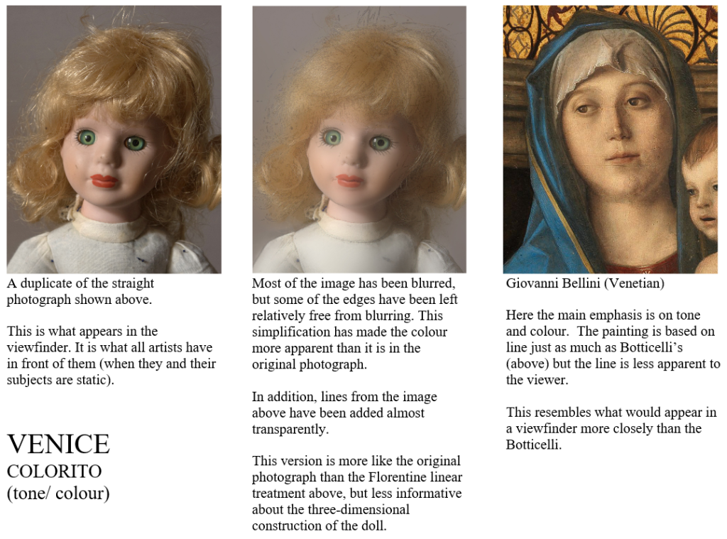
HEAD OF A DOLL
Here a photograph of a doll’s head is adjusted in order to mimic the different colouring of the Florentines and the Venetians. The Florentines were primarily interested in line and form*, while the Venetians placed slightly more emphasis on colour (especially tone-value). There was a great deal of similarity in their approaches, so I have attempted to exaggerate the differences in order to make them easier to see and understand.
*Drawing and painting ‘Form’ means giving the idea of three-dimensional solidity. This is done by translating the subject into readily understood solid objects such as cylinder, sphere and cone. A firm outline indicating these objects makes them easier to grasp in the imagination, while light and shade can make the form even more clear to the viewer.

LEONARDO – FLORENTINE MODELLING EXAGGERATED

The chart above shows 114 colours, but the word colour is also used in another sense, to mean only Hue and Chroma. In this sense, each column in the chart above is said to show only a single colour, but in different tonal values. In this sense, the chart shows 37 colours.

Titian (Venetian) on the right
Florentine painters could use colour as bright and strong as that of the Venetians; but the Venetians were more concerned with grouping colours into areas which were close in tonal value.
Venetian outlines can often be as sharp as those of the Florentines, but, because of tonal grouping, their outlines do not stop the viewer’s eye in the way that they do in Florentine painting.
The Venetians tended to paint true-to-life Hue, Value and Chroma. This helps the viewer’s eye to move easily from one area of colour to the next. This is why the Venetians were called colourists.
The Florentines used equally bright colour, but their tonal values were not grouped as coherently as those of the Venetians. In Florentine painting the viewer’s eye does not flow as easily from colour to colour, but is constantly interrupted by outline. This is why the Florentines were known more for line and form (three dimensional solidity) than for colour: (for disegno rather than for colorito).
The Venetians took care not to make tonal contrasts greater than they were in nature, even reducing the contrast at times.
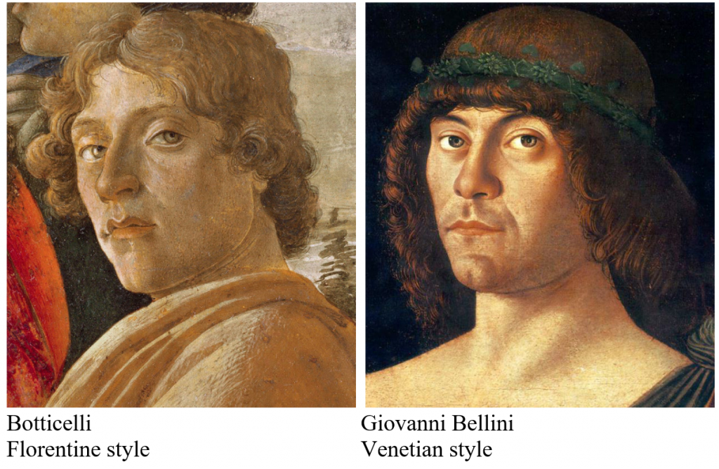
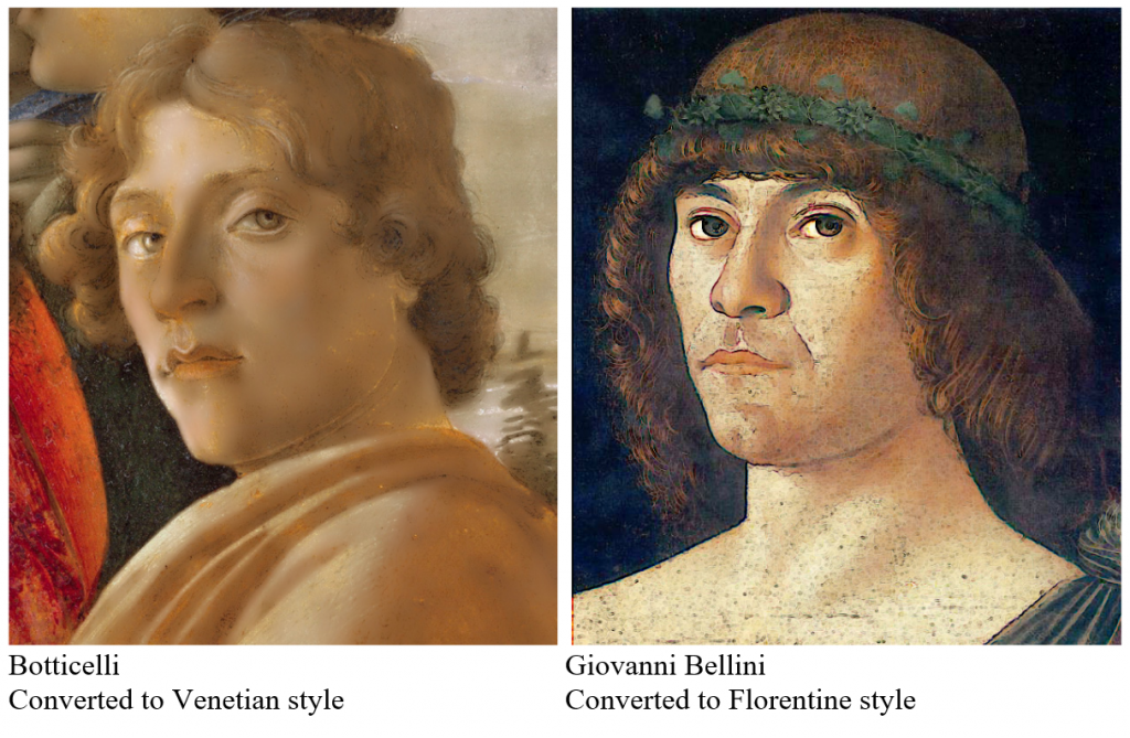
The difference between Venetian and Florentine can be difficult to discern at first, particularly for viewers who are attuned to the extremely bright colours of more recent paintings. In the reproductions below there are two heads, one painted by a Florentine and the other by a Venetian. In the version below these, I have attempted to change the style of the Florentine into the Venetian, and vice versa.
SANDRO BOTTICELI (FLORENCE) versus GIOVANNI BELLINI (VENICE)
Centuries later, some painters went even further than the Venetians in making tonal contrasts match the subtlety seen in a viewfinder. Monet and Van Gogh are examples:
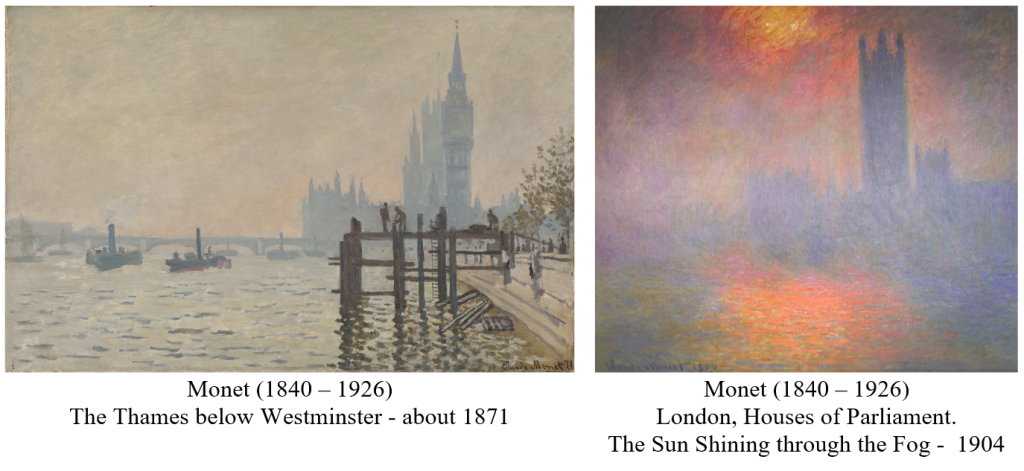
In 1871 Monet’s colouring was very true-to-life, with a full range of tone. Three decades later he was limiting the tonal range. This put more emphasis on colour (in the sense of hue and chroma). Not only did he limit tonal range, but he sought out subjects, such as the fog of London, which were already restricted in this range.
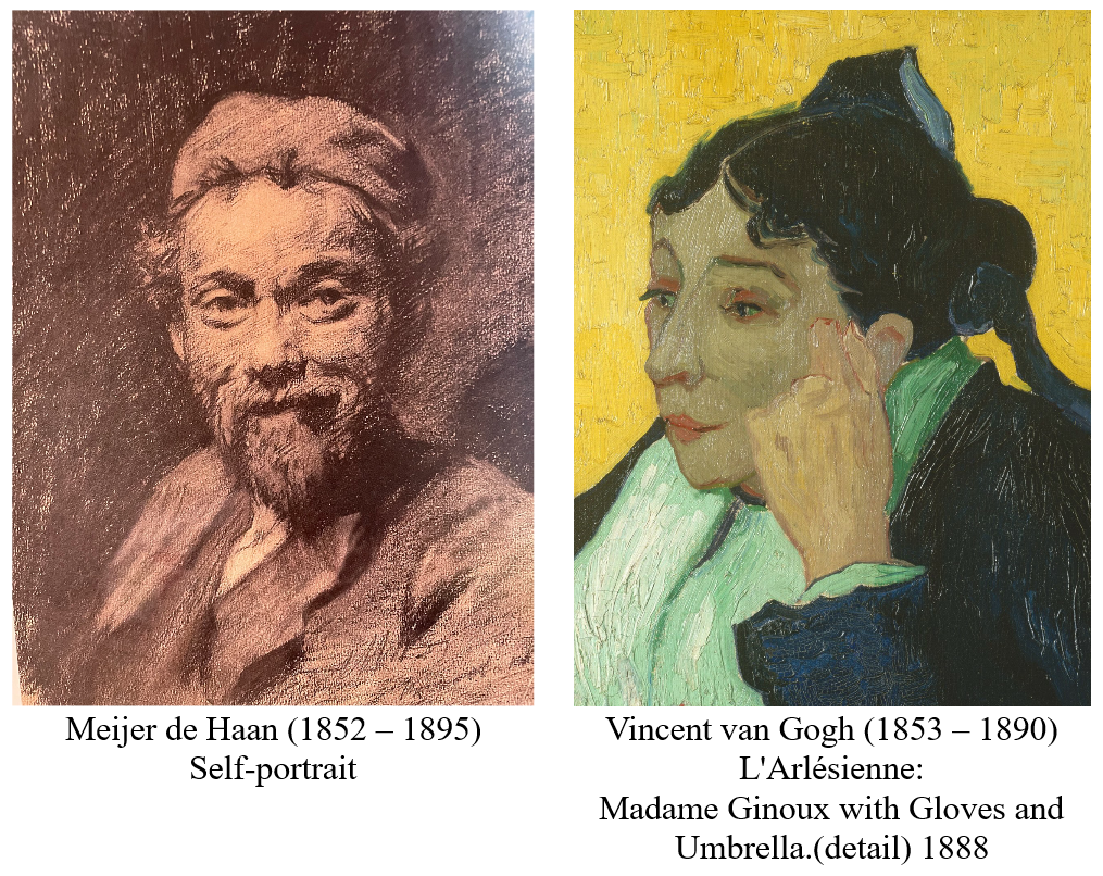
In ‘L’Arlésienne’ the tonal range in each area is greatly reduced (for example, there is very little light and shade in the face). This limited ‘chiaroscuro’ would make it hard for the viewer imaginatively to grasp each solid object, so some sort of compensation would be required.
Van Gogh compensated by giving extra emphasis to outline, thus producing what he called ‘a new type of drawing’.
These drawings by de Haan are very fine, I like them very much. Yet to do that with colour, to manage so much expression without the help of chiaroscuro in black and white, damn it all, it is not easy. And he will even arrive at a new type of drawing if he carries out his plan of passing through impressionism as a school, considering his new attempts in colour merely as studies. But in my opinion he is right over and over again to do all this.
Letter from Vincent van Gogh to Theo van Gogh
Arles, c. 6 November 1888
So the term ‘colourist’ has several meanings, which often overlap. The term is applied to painters who:
- Place emphasis on areas of Hue, Value and Chroma, rather than on outline and exaggerated contrasts in Value. This stresses the overall pattern of tone and enhances a sense of atmosphere. E.g. Titian
- Reduce the contrasts in Value and so place more emphasis on Hue and Chroma, often increasing the Chroma in order to make the hue and chroma more eye-catching. E.g. Monet and Van Gogh.
- It also has a third meaning – a very loose one which brings confusion: according to many of today’s critics, anyone who uses bright colour is classed as a colourist. In this sense the Florentines were colourists just as much as the Venetians, in fact Florentine colour was sometimes stronger than Venetian colour.

The Resurrection (c. 1463–65)
Some of the colours here are as strong and as bright as they can be.
Strength of colour did not distinguish the Venetians from the Florentines, but rather grouping of tonal values
The use of the word ‘colourist’ to describe any painter who uses bright colour deprives it of almost all meaning. It makes nonsense of the distinction between disegno and colorito. This crude use of the word ‘colourist’ occurs frequently in reviews of modern exhibitions.
Florentine:
Giotto; Masaccio; Fra Angelico; Piero della Francesca; Botticelli; Leonardo; Raphael; Michelangelo
Venetian:
Piero della Francesca; Mantegna; Giovanni Bellini; Giorgione; Titian; Tintoretto; Veronese.
Venetian versus Florentine colour from Visual Arts Cork
We can discover in Venetian colour, as it developed in the hands of Titian in the first two decades of the sixteenth century, three main tendencies:
firstly, a severe limitation in the actual number of hues, which very much contrasts with the emphasis on variety in Florentine High Renaissance painting;
secondly, a tendency to choose the purest hues in their richest and most saturated state;
thirdly, the intention to arrange them in overall harmonies that are simpler yet more sophisticated than the mere balancing of bright, contrasting colours that had gone before.
These tendencies are remarkable in themselves, but they have their basis in a more fundamental change of which they are an expression. They depend on what amounts to a new mode of vision, which may be loosely described as ‘perceptual’ and still more loosely as ‘realistic’, a term applied by Titian and others of the Venetian Renaissance, who saw in his handling of light and colour a way of recording in paint a sense of living reality not achieved before.
http://www.visual-arts-cork.com/history-of-art/titian-venetian-colour.htm#characteristics
The idea that all colours may be calibrated on a scale between black and white and have, according to their mixture of hue and tone, relative weights comparable to tones in music, is found in Aristotle. It justifies the view, proposed incidentally with regard to Venetian painting by the English landscape painter John Constable (1776-1837), that the harmony of colours has an intellectual as well as a sensuous base.
http://www.visual-arts-cork.com/history-of-art/titian-venetian-colour.htm#characteristics
Note: Venetian colour is not so easy to see now as it was because restorers have been wiping off paint. The Venetian technique depended largely on adding translucent layers of paint. When these are removed, all that is left is the dry underpainting – which looks more similar to a Florentine painting that it would have done. This very thorough stripping began after WWII, so reproductions in books before that time can often give a truer impression of how the paintings appeared orginally than the paintings themselves do now.
______________________________
To summarise the Cork article.
1. Fewer hues – less variety of hue.
- Brighter at their brightest.
- Grouped more harmoniously.
4. More realistic – More like the image-in-the-viewfinder._______________________________
Florentine colour developed from outline, form (added by Giotto and Masaccio), then colour (added by many, say Raphael for example). The colour is form with colour added.Florentine: Giotto; Masaccio; Fra Angelico; Piero della Francesca; Botticelli; Leonardo; Raphael; Michelangelo (?)Venetian: Piero della Francesca; Mantegna; Giovanni Bellini; Giorgione; Titian; Tintoretto (?) ; Veronese.