SOLOMON J SOLOMON – REDUCING THE ROUND TO THE FLAT

Samson (1887)
Walker Art Gallery, Liverpool, UK
https://artsandculture.google.com/asset/samson-solomon-j-solomon/6AFRiIReWUH60g

Self-portrait, c. 1896
After considering the principle of the image in the viewfinder, and how to transcribe that image with the assistance of optical devices, I shall now turn to ways in which artists have transcribed the image by eye – that is without optical devices (apart, sometimes, with a plumb-line or a pencil held out at arm’s length). First of all there is the principle of looking at the shapes in the scene, rather than at what those shapes signify. Solomon J Solomon RA RBA (1860 – 1927) wrote probably the first description of drawing by the ‘background shapes’. These are now more frequently known as ‘negative shapes’.
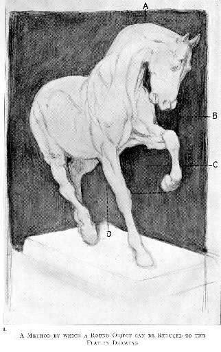
Let me tell you how I should go about, and how I really did set about, the drawing from the cast of the Rosa Bonheur anatomised horse.
Solomon J Solomon, Oil painting 1910
I foreshortened it expressly. Foreshortening is difficult, but most of the real difficulties are re-moved by the system I want you to use. I placed behind the cast of the horse a flat square object, indicated by the toned passages in Plate II. (The picture above).
I remembered that this cast, like every other object, covers a definite space on its background from any one given point of view. I had to settle, as you will always have to, before starting, the scale of the drawing.
I looked at the cast, my eyes almost closed, and then drew the space, under A, lying between the neck and the jaw, a little island of black, treating the shape if it as I would a freehand drawing. I had by this created my Standard of Measurement.
Proceeding upon this basis, I did not ask myself yet whether I was drawing a head or legs or body, because I knew that if I drew the patterns left by the white cast on the background, in proportion with the passage already indicated, my subject would be evolved.
My eyes remained always nearly closed. I was reducing the round object to the flat — that is to say, to the spaces occupied by its parts on the background.
https://archive.org/details/in.ernet.dli.2015.96596

When seen in this way, the shapes can be easier to copy accurately.
I had to be careful, when I came to that particular point, to keep the raised knee in its exact relative position under the nostrils, and to imitate the hay (B) left between the nostrils, the chest, and forearm.
Solomon J Solomon, Oil painting 1910
Then as I came to it, I had to consider that the raised hoof should be latitudinally opposite the point of the knee of the standing leg, and to imitate the harbour-like form at C enclosed between these legs. And in the same way I had to fix the shape between the off hind and standing leg, in its proportion and relative position to the harbour (C).
I looked up and down the cast continually to make each “point” fall into its place under or over another already indicated, and then laterally across it with a similar object.
I compared the slanting lines with the set square of the book behind, and so on, and saw by the aid of a hand-glass — which is absolutely indispensable to the draughtsman — that the proportion of my black masses, the direction of my lines, and in fact the whole drawing, tallied fairly with the cast.
These are just a few of the things upon which I had to fix my attention, but at the same time and almost unconsciously, my eye was taking in all the internal drawing. I knew that every part must fit and, by indicating the various masses contained within the outline of the horse, prove the accuracy of the whole.
Herein lies the true secret of draughtsmanship. When we would do serious drawing we must concentrate our attention not upon the outlines only, but upon the mass contained within these outlines. This advice may sound like a commonplace. In theory perhaps it is so ; but the student will have learnt an invaluable lesson when he has thoroughly realised this commonplace and knows how to put it into practice.
It embodies the meaning of the phrase which he is always hearing from the master, but which he rarely seems to grasp — Draw by the masses !
When he has grasped this piece of instruction, and can at a glance realise the shapes in their just proportions made by the shadow, half-tone, and light masses — that is to say, all the main incidents of the internal drawing of his subject — he may take a holiday.
https://archive.org/details/in.ernet.dli.2015.96596
HOW THE ARTIST TRANSCRIBES (COPIES) THE SCENE IN THE VIEWFINDER.
This copying purely of coloured patches did not develop all of a sudden. It emerged gradually, gaining in importance as the years went by, though always in conjunction with those conceptualizations which artists had learnt from predecessors.
In a chapter in ‘Manners and Morals’ (1987) Rica Jones summarized the techniques of face painting in the seventeenth century. The method was to make a painting which resembled a patchwork quilt or a mosaic, and then to soften it.

Richard Boyle, 2nd Viscount Shannon (detail) c1710
National Portrait Gallery, London, UK.
This unfinished portrait shows the ‘dead colouring’ (‘dead’ = not glossy) some parts are slightly blended or ‘sweetened’).
The manner of painting a face in the seventeenth century, as described by the manuals of painting, was as follows. After the head had been drawn onto the canvas, the artist began the first painting or dead colouring. The purpose of dead colouring was ‘to mark everything in its proper place and to sweeten it well to prevent the trouble of correction and amendment’.[12] …
Rica Jones in:
The flesh tints for the dead colouring were mixed up and laid out on the palette before painting was begun. …
Marshall Smith recommended that the tints be laid on the canvas from light to dark; others said the opposite. All agreed that at this stage the colours should be laid on in patches, with no attempt made to soften the gradations. This latter process, known as sweetening, came after the dead colouring was complete but still wet. To sweeten his work, the artist took a clean brush and very lightly hatched across the joins to soften them.
…
Although the range of colours and number of tints varied from artist to artist and experienced painters could mix up many on the canvas as they worked, this manner of painting was pretty standard and accounts for the solidity we associate with seventeenth-century portraiture.
4 Smith, Marshall, The Art and Practice of Painting According to the Theory and Practice of the Best Italian, French and German Masters, 1692, p.77.
5 Bardwell, Thomas, The Practice of Painting and Perspective Made Easy, 1756.
12 Elsum, John, The Art of Painting after the Italian Manner, 1704, p.38.
Manners & morals : Hogarth and British painting 1700-1760
by Einberg, Elizabeth
https://archive.org/details/mannersmoralshog0000einb

Maurice Suckling
Bardwell wrote a manual in which he recommended painting a flat mosaic, to be blended when finishing.
CAREFUL MATCHING WITH THE PALETTE-KNIFE

The Laboratory 1895
By courtesy of Christie’s
John Collier described an extremely simple way in which to obtain accurate shape and colour, but he regarded this as only basic training. His own work demonstrated the more imaginative approach which he developed.
The Hon John Collier, like many other academic painters of the 19thC, explains the same process. Though the process for him was not only for the initial paint layer, but the subsequent layers too.
The first thing to be done is to match the tints of the object, and to put them on the canvas in their proper places without the slightest attempt at detail or execution ; and the easiest way to do this is to take the palette-knife, mix—to the best of one’s judgment —a tint corresponding to some patch of colour on the object, and then hold up the palette-knife in front of this patch of colour and compare the two. When the comparison is put in such a direct manner to the eye no very bad match can pass muster. The first shot will probably be ludicrously unlike, and the mixture must be modified again and again until complete success is arrived at, which is only the case when the end of the palette-knife can hardly be distinguished from the patch of colour in front of which it is held. The paint should then be dabbed on to the proper place on the canvas, and spread with a brush until it is of the proper size and shape, care being taken that the colour be sufficiently thick to prevent the canvas showing through. This operation should be repeated for every considerable patch of colour or light and shade in the object or in the background until the canvas is completely covered, when it should look like a sort of mosaic, giving, when seen at some distance, a good idea of the general look of the object without any of its details. It is an operation of great tediousness, but it should be strenuously persevered with, as there is no other method by which a beginner can hope to give anything like a really accurate reproduction of the tints of a natural object.
The Hon. John Collier
Besides being tedious, the operation has certain difficulties which can only be overcome by the exercise of considerable care. It will be found at once that the tint on the palette-knife varies very much according as it is turned towards the light or away from it. To make the results uniform the canvas should first of all be placed in a fairly strong light, but sufficiently turned away from the window to prevent any shine from appearing on its surface when painted on. (This must be made the subject of direct experiment: a dab or two of paint will settle the matter.) The palette-knife should then be held close to the picture, with its surface parallel to the surface of the picture ; if the colours be matched with the knife in this position they will look the same when they are placed on the canvas as they did whilst being matched. It is obvious that if this be not the case the matching can only give false results.
A manual of oil painting, 1887
https://archive.org/details/manualofoilpaint00colliala
MAKING THE MOSAIC CLEARER THAN BEFORE


San Diego Museum 1892
Sargent left the mosaic plainly visible. The only blending comes from placing brushstrokes in the wet paint. There no softening or sweetening after the brushstrokes have been placed. Apart from that, the approach is very much as described in the old manuals.

Le-déjeuner-sur-lherbe_1865(detail)
Monet emphasised the flat shapes even more than Sargent.

Sir George Grey (detail)
The sense of a mosaic has been obliterated, and the painting looks very much like a photograph, even though the brushstrokes are noticeable.
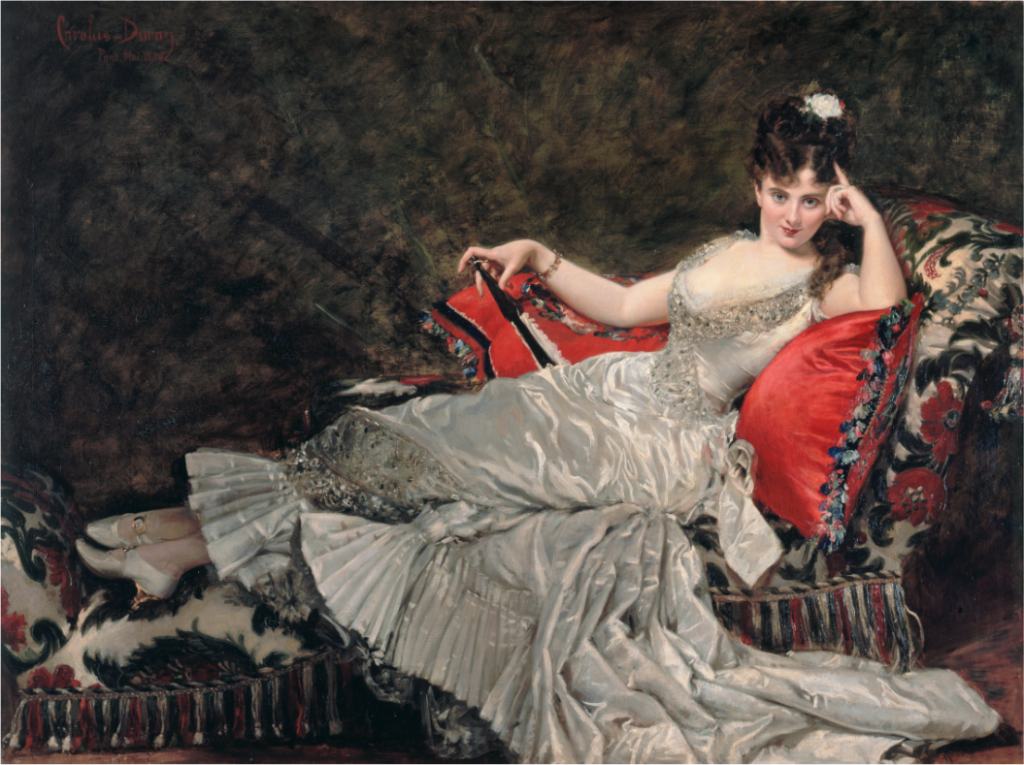
The French academic painters such as Carolus-Duran painted in a similar way, laying more emphasis on the freshness of the paint-surface. They aimed to finish in one layer as far as possible, an approach known as ‘Alla Prima’, ‘au Premier Coup’, or even ‘at the first blow’. Sargent became the most spectacular exponent of this approach, even though he did not always finish in one layer.
Mademoiselle de Lancey 1876
A lively interpretation of the subject, which nevertheless depended on accurate recording of colour and tone. Carolus-Duran followed a method which Sargent made more obvious to the viewer. Sargent severely reduced the amount of blending.
Claude Monet (1840–1926) instructed another painter to follow this long-established advice.
“When you go out to paint, try to forget what objects you have before you — a tree, a house, a field. . . . Merely think, here is a little square of blue, here an oblong of pink, here a streak of yellow, and paint it just as it looks to you, the exact color and shape.”
Monet’s advice to the American artist Lilla Cabot Perry.
“Reminiscences of Claude Monet from 1889 to 1909”,
The American Magazine of Art, Vol. 18, No. 3, MARCH, 1927
https://www.jstor.org/stable/23931183 (subscription required)
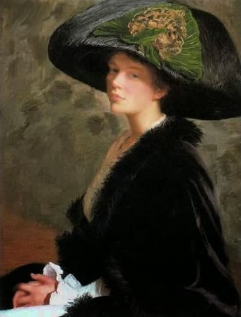
The Green Hat (Self -portrait) 1913
Monet’s main innovation was in omitting any ‘sweetening’, even that achieved by skilful brushwork like Sargent’s. Monet thus made the mosaic effect more eye-catching. But even this was not as novel as it may have seemed. Vermeer, two centuries earlier, had also softened less than his contemporaries.
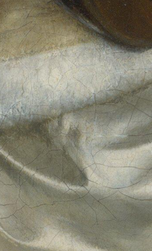
17th C Dutch – DIVISION INTO PATCHES OF COLOUR

Ter Borch blended his areas with great subtlety, whereas Vermeer tended to leave his areas separate, with very little blending, if any.
This gives the Vermeer a ‘paint-by-numbers’ appearance – something which endeared him to artists of the late 19thC who followed the French Impressionists. Monet’s patches, for example, though larger than those of Vermeer, were similarly unblended.
A Woman playing a Lute to Two Men (detail)
The areas of tone are blended. Transitions from one patch of colour to the next are soft and continuous.

A Young Woman standing at a Virginal (detail)
The areas of tone are much less blended, if at all. Transitions from one patch of colour to the next are abrupt.
The novelty of the Impressionist style was not that its exponents saw differently (their eyes were much the same as everyone else’s), nor was it that they found colour in shadows (painters had always known shadows were coloured), nor that they painted the effect of light (painters had done that effectively before), nor that they painted fleeting effects (earlier painters had painted effects much more fleeting): it was that they painted slightly paler, and left areas of colour less blended than their immediate predecessors. This forced the viewer to notice patches of colour, rather than to recognise them as objects and figures as quickly as they had done with earlier paintings.
The observation of patches of colour had had a long history before the Impressionists brought it to its final stage.